

Project Overview
This is one of the Maven Analytics challenges I worked on. The project was about analyzing Pixar Animation Studios’ films and finding which movies performed the best across revenue, profit, ratings, awards, genres, and return on investment (ROI).
The dashboard was designed as a small interactive report where users can explore both the overall performance of Pixar and the details of every individual film released by the studio.
The Business Problem
Since the beginning of Pixar Animation Studios, many animated films have been released. Among those films, which ones performed the best in terms of revenue, profit, ratings across three different platforms, genres, awards, and ROI?
The goal was to turn a collection of film data into a report that answers these questions in a simple and interactive way.
Project Objectives
The main goal was to analyze the provided film dataset and present the results through an interactive Power BI dashboard.
I also wanted users to be able to explore each film individually while still getting a complete picture of Pixar’s overall performance and history.
Data & Preparation
I started by cleaning and normalizing the dataset, then separated it into fact and dimension tables to build a proper star schema in Power BI.
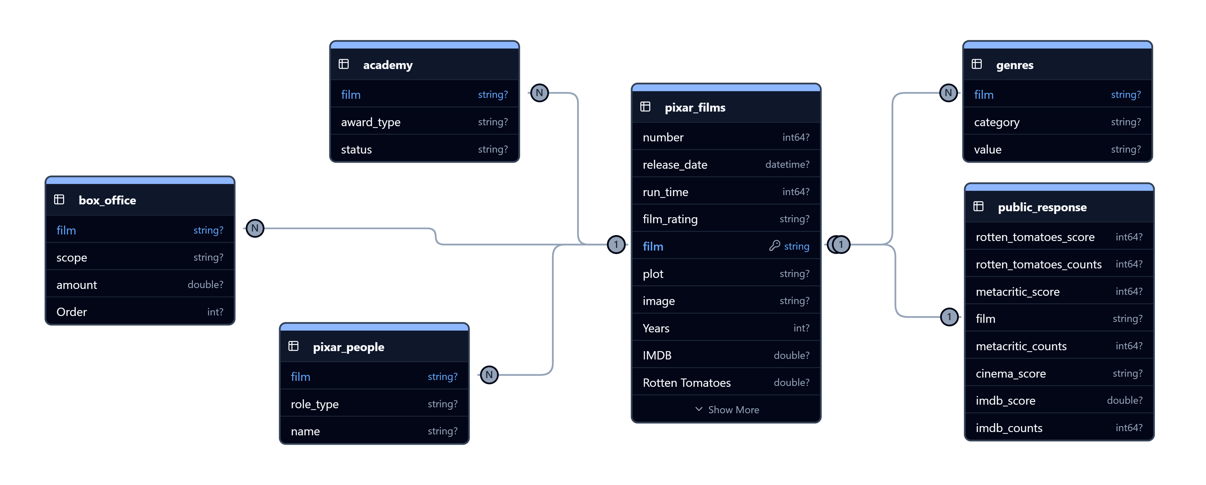
The original dataset was enough for the analysis, but I wanted to make the dashboard more visual. I collected the poster for every Pixar film through web scraping and added them to the model. This made the movie pages much more engaging and easier to explore.
Dashboard Design
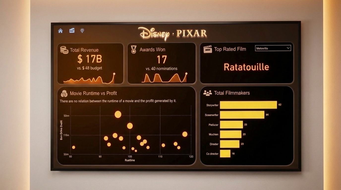
The first page provides a high-level overview of Pixar Animation Studios. It highlights the studio’s overall performance through key KPIs such as total revenue, awards won, nominations, top-rated film, profit analysis, and the distribution of filmmakers by role.
The second page is dedicated to individual films. Users can select any Pixar movie and explore its release date, plot summary, ratings from IMDb, Rotten Tomatoes, and Metacritic, director, runtime, box office performance, and regional revenue breakdown.
The final page focuses on story-driven insights from the data. It highlights Pixar’s journey from its first film, identifies the highest-grossing and highest-ROI films, compares the best and worst ROI, and shows how audience ratings have evolved over time across different platforms.
Key Insights
The analysis revealed several interesting findings about Pixar’s films.
- Pixar films generated more than $17 billion in worldwide box office revenue from a production budget of around $4 billion.
- Pixar films have won 17 major awards and received 40 nominations across the dataset.
- Toy Story 3 is Pixar’s highest-grossing film, earning about $1.07 billion worldwide while also being one of the studio’s highest-rated movies across IMDb, Rotten Tomatoes, and Metacritic.
- Toy Story (1995) delivered the highest return on investment, making it Pixar’s most profitable film relative to its production budget.
- Movie runtime showed no clear relationship with box office profit. Longer movies did not necessarily generate higher earnings.
Outcome
The final result was a three-page interactive Power BI dashboard that lets users explore Pixar’s film history from different perspectives. It combines studio-level KPIs, detailed movie profiles, and story-driven insights into a single report.
What I Learned
This project helped me practice more than just building charts in Power BI.
I worked on designing a proper star schema, creating reusable DAX measures, and thinking about how to present insights as a story instead of a collection of visuals. I also learned how small additions, like collecting movie posters through web scraping, can make a dashboard much more engaging without changing the underlying analysis.