

Project Overview
This project was an Excel-based cost comparison calculator and dashboard that I built for a client to compare the financial impact of two service delivery methods: a Traditional Solution and a Remote Solution. Instead of manually calculating costs for every project, the client can now select a few inputs, and the workbook automatically calculates weekly, monthly, and annual costs while visually comparing both options in a clean dashboard.
The goal was not just to automate calculations, but to make the decision-making process faster, easier, and less prone to errors.
The Business Problem
The client was providing services through two different methods: Traditional and Remote. For every project, they were manually calculating the costs for each method across different timeframes to determine which option was more cost-effective.
This manual process was time-consuming, repetitive, and prone to calculation errors. As the number of projects increased, comparing both methods became even more difficult.
Project Objectives
My main goal was to understand the client’s workflow and streamline it by automating the entire calculation process.
Specifically, I wanted to:
- Replace manual calculations with automated formulas.
- Make the workbook easier to use and understand.
- Allow the client to compare both service methods instantly.
- Present the results in a simple dashboard for quicker decision-making.
Data & Preparation
First, I gathered the client’s existing workflow. I sat with the client twice to understand the complete process, the inputs they used, and how they calculated costs for each service method.
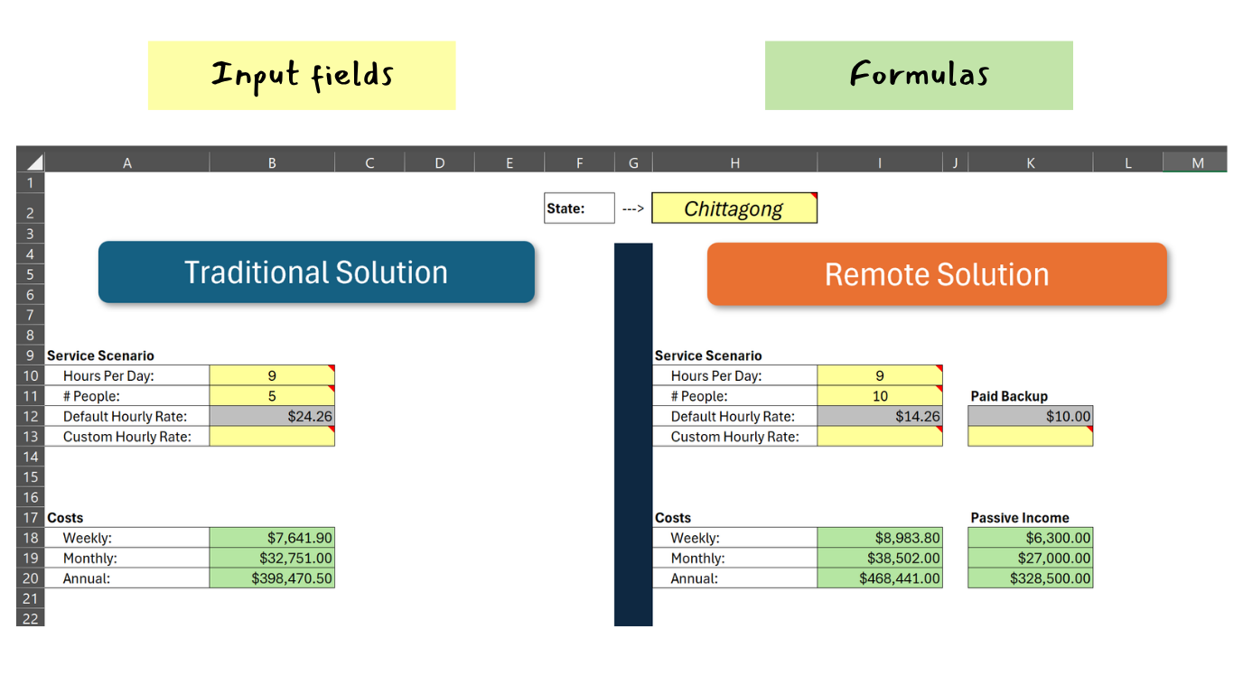
Once I understood the workflow, I normalized the workbook by replacing hard-coded values with named ranges and drop-down lists. This made the workbook much easier to maintain and reduced the chances of accidental errors.
After that, I created the necessary input fields, built all the required calculations, and organized everything into two separate sections based on the two service methods.
Dashboard Design
Although the calculated numbers were enough to make a decision, I wanted the client to understand the results at a glance.
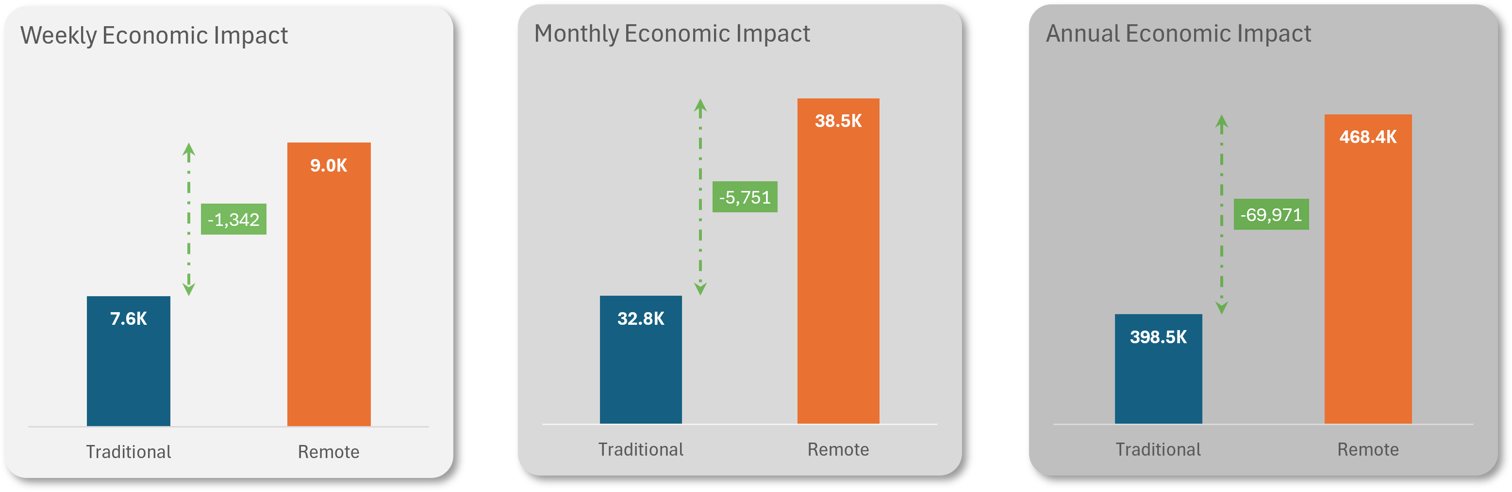
To make the comparison more intuitive, I added three cost comparison charts showing the economic impact across weekly, monthly, and annual timeframes. The dashboard updates automatically whenever the user changes the inputs, making it easy to compare different project scenarios.
Outcome
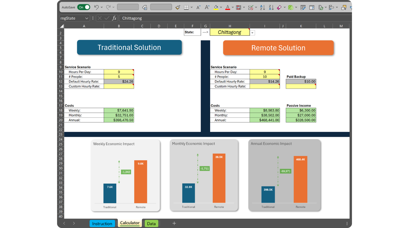
Finally, I combined the calculations and visualizations into a clean, professional dashboard where the client can immediately see the financial impact of choosing either service method for a specific project.
The final solution reduced manual work, eliminated repetitive calculations, and made comparing both options much faster and more reliable.
What I Learned
This project taught me that building a good Excel solution is not just about writing formulas—it starts with understanding the business process first.
I learned how to translate a client’s real-world workflow into a structured and automated Excel model, use named ranges and data validation to build a more maintainable workbook, and design dashboards that help users make decisions instead of just showing numbers.
Most importantly, I learned the value of discussing the workflow with the client before building the solution. Spending time understanding the problem made the final workbook much simpler and more useful.