

Project Overview
This project demonstrates how marketing campaign data can be transformed into an executive dashboard that tracks campaign performance across channels, devices, locations, and time.
The goal was not just to visualize marketing metrics, but to create a report that helps stakeholders understand where conversions are coming from, which campaigns perform best, and where marketing spend generates the highest return.
The Business Problem
The client was running multiple marketing campaigns across different channels, devices, and locations. Although the data was available, it was difficult to answer simple business questions such as:
- Which channel drives the most conversions?
- Which device performs better?
- Which campaigns generate the highest value?
- How does performance change over time?
The existing reporting focused on isolated metrics instead of providing a complete performance overview.
Project Objectives
The primary objective was to build a centralized Power BI dashboard that gives both high-level and detailed views of campaign performance.
Data & Preparation
I cleaned and transformed the data in Power Query, standardized column names and data types, and created the necessary calculated columns and measures in DAX.
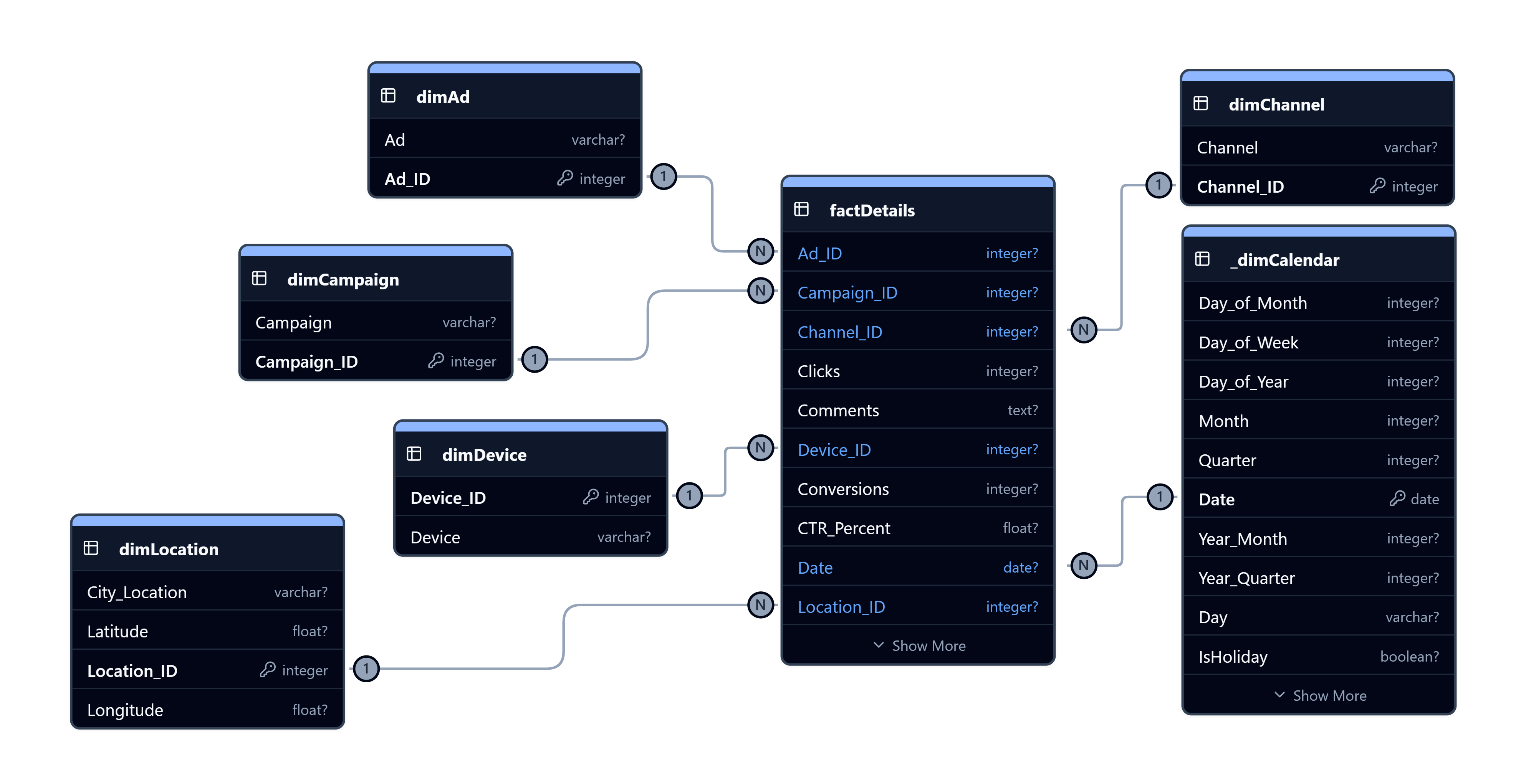
The model was designed using a star schema, with fact tables for campaign performance and dimension tables for calendar, campaign, channel, device, and location. This structure made filtering and cross-page interactions efficient and easy to maintain.
Dashboard Design
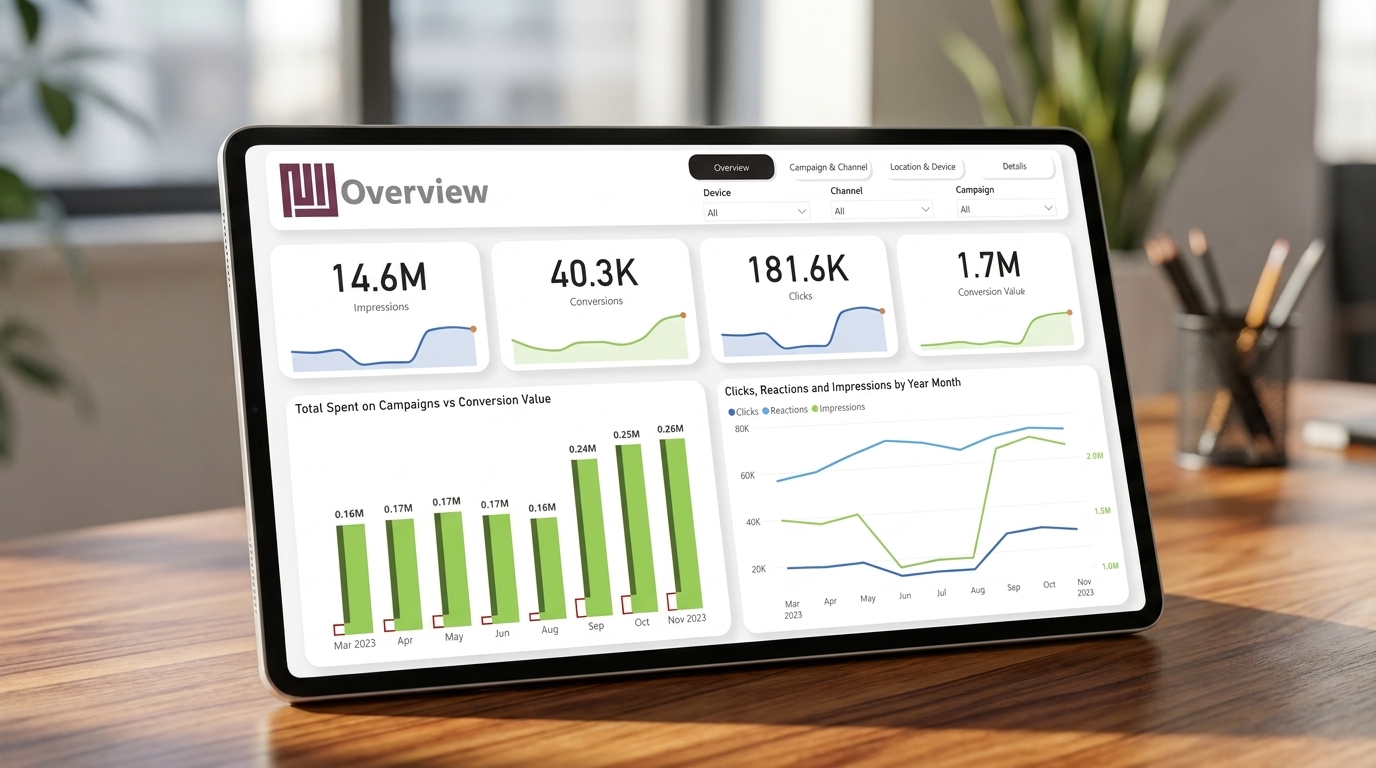
The design requirement was to keep the interface minimal, modern, and easy to navigate. I separated the report into four pages so users can move from an executive overview to detailed analysis without overwhelming the screen.
Key Insights
The dashboard revealed several clear performance patterns across campaigns, channels, devices, and time.
- Campaign performance peaked in Q4: Monthly conversion value remained around 0.16–0.17M from March through August, then increased sharply to 0.24M in September, 0.25M in October, and 0.26M in November — the highest-performing month.
- Desktop users converted better than mobile users: Desktop campaigns generated 21,310 conversions from 88,832 clicks, achieving an average CTR of 1.53% and a 24.0% conversion rate. Mobile campaigns attracted comparable traffic volumes but showed a consistently lower conversion rate across most months.
- September marked a significant performance jump: Impressions increased from roughly 1.0M in August to over 2.0M in September, while clicks rose from around 13K to nearly 28K. This indicates a major campaign scale-up beginning in September and continuing through November.
Outcome
The final solution provides a complete marketing performance dashboard that combines executive KPIs with detailed campaign analysis.
Instead of reviewing multiple reports, stakeholders can monitor campaign health, compare channels and devices, analyze geographic performance, and drill into conversion drivers from a single interactive Power BI report.
What I Learned
This project strengthened my dashboard design and analytical storytelling skills in Power BI. I learned how to organize a report into multiple pages while keeping navigation simple and consistent.
I also gained more experience building reusable DAX measures, designing star schemas for marketing analytics, and using visuals such as decomposition trees, maps, and conditional formatting to help users move from high-level KPIs to detailed insights.