<?xml version="1.0" encoding="utf-8"?><feed xmlns="http://www.w3.org/2005/Atom" ><generator uri="https://jekyllrb.com/" version="4.4.1">Jekyll</generator><link href="https://nijobair.github.io/feed.xml" rel="self" type="application/atom+xml" /><link href="https://nijobair.github.io/" rel="alternate" type="text/html" /><updated>2026-08-24T20:05:36+00:00</updated><id>https://nijobair.github.io/feed.xml</id><title type="html">NIJobair</title><subtitle>A continuous learner.</subtitle><author><name>Nazmul Islam</name></author><entry><title type="html">A Dummy Article with Different HTML Elements</title><link href="https://nijobair.github.io/posts/powerbi/a-dummy-article/" rel="alternate" type="text/html" title="A Dummy Article with Different HTML Elements" /><published>2026-08-17T00:00:00+00:00</published><updated>2026-08-17T00:00:00+00:00</updated><id>https://nijobair.github.io/posts/powerbi/a-dummy-article</id><content type="html" xml:base="https://nijobair.github.io/posts/powerbi/a-dummy-article/"><![CDATA[<h1 id="heading-hierarchy">Heading Hierarchy</h1>

<h2 id="heading-2">Heading 2</h2>

<h3 id="heading-3">Heading 3</h3>

<h4 id="heading-4">Heading 4</h4>

<h5 id="heading-5">Heading 5</h5>

<h6 id="heading-6">Heading 6</h6>

<p>A well-designed article should have a clear visual hierarchy.</p>

<p>The <code>h1</code> normally represents the article title, while <code>h2</code> and <code>h3</code> divide the article into logical sections.</p>

<h1 id="text-formatting">Text Formatting</h1>

<p>This is <strong>bold text</strong>.</p>

<p>This is <em>italic text</em>.</p>

<p>This is <strong><em>bold and italic text</em></strong>.</p>

<p>This is <del>deleted text</del>.</p>

<p>This is <u>underlined text</u>.</p>

<p>This is <mark>highlighted text</mark>.</p>

<p>This is <small>small text</small>.</p>

<p>This is H<sub>2</sub>O.</p>

<p>This is X<sup>2</sup>.</p>

<p>This is <code>inline code</code>.</p>

<p>This is <kbd>Ctrl</kbd> + <kbd>C</kbd>.</p>

<p>You can also use <abbr title="Key Performance Indicator">KPI</abbr> abbreviations.</p>

<p>Here is a link <a href="https://github.com">GitHub</a> that opens in the same tab. And <a href="https://github.com" target="_blank" rel="noopener">GitHub</a> will open in a new tab.</p>

<h1 id="images">Images</h1>

<p data-caption="Diagram: Demo diagram from Excalidraw"><img src="/assets/images/excalidraw-trial.svg" alt="Excalidraw Diagram" class="has-caption excalidraw ml-auto mr-auto" /></p>

<p data-caption="Figure: Demo image with caption"><img src="https://picsum.photos/1200/600" alt="Image with caption" class="has-caption post-img ml-auto mr-auto" /></p>

<div class="powerbi-embed has-caption" data-caption="Dashboard: Event visualization with custom calendar">
    <iframe title="Event Calendar" src="https://app.powerbi.com/view?r=eyJrIjoiOTYxNDNmM2UtNzJlOC00YzdjLWFhNTctZTAzM2Q0Y2JjZDJhIiwidCI6ImRjM2YyNGU5LTAyYjktNGZiMC05NzE2LWQ1NTYzOTVlNWVlNSIsImMiOjl9&amp;pageName=8b09270edfd60077e6bf" frameborder="0" allowfullscreen="true"></iframe>
</div>

<div id="chart-01" class="has-caption" data-caption="Chart: Dummy chart demonstrating Vega functionalities"></div>
<script type="text/javascript">
  async function run() {
    const container = document.getElementById('chart-01');
    const width = container.clientWidth - 40;
    const height = width * 9 / 16;
    const specs = '/vegaCharts/example.json';
    const result = await vegaEmbed("#chart-01", specs, {
      actions: true,
      width: width,
      height: height
    });
    console.log(result);
  }
  document.addEventListener('DOMContentLoaded', run);
</script>

<div id="custom-board-01" class="jxg-embed has-caption" data-caption="Chart: Demo for JSXGraph"></div>

<script type="text/javascript">
  window.addEventListener('load', function() {
    if (typeof window['renderCustomBoard'] === 'function') {
      window['renderCustomBoard']('custom-board-01');
    }
  });
</script>

<h1 id="blockquotes">Blockquotes</h1>

<blockquote>
  <p>Data is valuable only when it helps someone make a better decision.</p>
</blockquote>

<p>A longer blockquote can contain multiple paragraphs 🚀.</p>

<blockquote>
  <p>Analysis requires curiosity.</p>

  <p>Visualization requires clarity.</p>

  <p>Communication requires understanding your audience.</p>
</blockquote>

<p>Nested Blockquotes</p>

<blockquote>
  <p>This is the first level.</p>

  <blockquote>
    <p>This is the second level.</p>
  </blockquote>

  <blockquote>
    <blockquote>
      <p>This is the third level.</p>
    </blockquote>
  </blockquote>
</blockquote>

<h1 id="unordered-lists">Unordered Lists</h1>

<ul>
  <li>Sales
    <ul>
      <li>Revenue</li>
      <li>Units</li>
      <li>Orders</li>
    </ul>
  </li>
  <li>Customers
    <ul>
      <li>New customers</li>
      <li>Returning customers</li>
    </ul>
  </li>
  <li>Products
    <ul>
      <li>Best sellers</li>
      <li>Worst sellers</li>
    </ul>
  </li>
</ul>

<h1 id="ordered-lists">Ordered Lists</h1>

<ol>
  <li>Data preparation
    <ol>
      <li>Remove duplicates</li>
      <li>Handle missing values</li>
      <li>Standardize formats</li>
    </ol>
  </li>
  <li>Analysis
    <ol>
      <li>Calculate KPIs</li>
      <li>Compare periods</li>
      <li>Identify anomalies</li>
    </ol>
  </li>
  <li>Reporting
    <ol>
      <li>Build dashboard</li>
      <li>Present insights</li>
      <li>Recommend action</li>
    </ol>
  </li>
</ol>

<h1 id="task-lists">Task Lists</h1>

<ul class="task-list">
  <li class="task-list-item"><input type="checkbox" class="task-list-item-checkbox" disabled="disabled" checked="checked" />Collect data</li>
  <li class="task-list-item"><input type="checkbox" class="task-list-item-checkbox" disabled="disabled" checked="checked" />Clean data</li>
  <li class="task-list-item"><input type="checkbox" class="task-list-item-checkbox" disabled="disabled" checked="checked" />Build data model</li>
  <li class="task-list-item"><input type="checkbox" class="task-list-item-checkbox" disabled="disabled" checked="checked" />Create measures</li>
  <li class="task-list-item"><input type="checkbox" class="task-list-item-checkbox" disabled="disabled" />Validate results</li>
  <li class="task-list-item"><input type="checkbox" class="task-list-item-checkbox" disabled="disabled" />Present findings</li>
</ul>

<hr />

<h1 id="definition-list">Definition List</h1>

<dl>
  <dt>Revenue</dt>
  <dd>The total income generated from selling products or services.</dd>
  <dt>Profit</dt>
  <dd>The amount remaining after subtracting costs from revenue.</dd>
  <dt>Margin</dt>
  <dd>Profit expressed as a percentage of revenue.</dd>
  <dt>KPI</dt>
  <dd>A measurable value used to evaluate performance against a business objective.</dd>
</dl>

<h1 id="code">Code</h1>

<p>A simple Python calculation:</p>

<pre><code class="language-python">revenue = 275
quantity = 65

average_revenue = revenue / quantity

print(average_revenue)
</code></pre>

<p>SQL Example</p>

<pre><code class="language-sql">SELECT
    category,
    SUM(revenue) AS total_revenue,
    SUM(quantity) AS units_sold
FROM sales
GROUP BY category
ORDER BY total_revenue DESC;
</code></pre>

<p>DAX Example</p>

<pre><code class="language-DAX">Total Revenue =
SUM ( Sales[Revenue] )
</code></pre>

<p>Power Query Example</p>

<pre><code class="language-m">let
    Source = Excel.CurrentWorkbook(){[Name="Sales"]}[Content],
    ChangedType = Table.TransformColumnTypes(
        Source,
        {
            {"Revenue", type number},
            {"Quantity", Int64.Type}
        }
    )
in
    ChangedType
</code></pre>

<p>When writing SQL, the <code>SUM()</code> function can be used to calculate totals.</p>

<h1 id="mathematical-expressions">Mathematical Expressions</h1>

<h3 id="1-global-sets--custom-macros">1. Global Sets &amp; Custom Macros</h3>
<ul>
  <li><strong>Inline Sets</strong>: Let $x \in \R$, $y \in \C$, $z \in \Z$, and $n \in \N$.</li>
  <li><strong>Vector Sum Macro (<code>\vectorsum{n}</code>)</strong>:
\(\vectorsum{5} = \vec{v}_1 + \vec{v}_2 + \vec{v}_3 + \vec{v}_4 + \vec{v}_5\)</li>
  <li><strong>Highlight Macro (<code>\highlight{math}</code>)</strong>:
\(\highlight{\int_{0}^{\infty} e^{-x^2} dx = \frac{\sqrt{\pi}}{2}}\)</li>
</ul>

<h3 id="2-physics--quantum-mechanics-physics">2. Physics &amp; Quantum Mechanics (<code>physics</code>)</h3>
<ul>
  <li><strong>Partial Derivatives</strong>: $\pdv{f}{x}$ and mixed second derivatives:
\(\pdv[2]{f}{x}{y} = \pdv{}{x}\left(\pdv{f}{y}\right)\)</li>
  <li><strong>Schrödinger Equation with Bra-Ket Notation</strong>:
\(i\hbar \pdv{\Psi}{t} = \hat{H}\Psi \implies \mel{\psi_a}{\hat{H}}{\psi_b} = E_a \braket{\psi_a}{\psi_b}\)</li>
</ul>

<h3 id="3-chemistry-equations-mhchem">3. Chemistry Equations (<code>mhchem</code>)</h3>
<ul>
  <li><strong>Precipitation Equilibrium</strong>:
\(\ce{Ag+(aq) + Cl-(aq) &lt;=&gt; AgCl(v)}\)</li>
  <li><strong>Thermochemical Reaction with Conditions</strong>:
\(\ce{2H2(g) + O2(g) -&gt;[{Pt\text{ catalyst}}][{\Delta}] 2H2O(l)} \quad \Delta H = -571.6\text{ kJ}\)</li>
</ul>

<h3 id="4-advanced-colors--canceling-color--xcolor--cancel">4. Advanced Colors &amp; Canceling (<code>color</code> / <code>xcolor</code> &amp; <code>cancel</code>)</h3>
<ul>
  <li><strong>Color Mixing &amp; Hex Codes</strong>:
\(\textcolor{blue!60!red}{\text{60\% Blue + 40\% Red}} \quad \text{and} \quad \textcolor{#ff5733}{\text{Hex Color \#FF5733}}\)</li>
  <li><strong>Canceling Terms in Algebraic Simplification</strong>:
\(\frac{(x - 1)(x + 3)\cancel{(2x + 5)}}{\xcancel{(2x + 5)}\bcancel{(x - 1)}} = x + 3\)</li>
</ul>

<h3 id="5-alignment-numbering--extensible-arrows-mathtools--ams">5. Alignment, Numbering &amp; Extensible Arrows (<code>mathtools</code> &amp; AMS)</h3>
<ul>
  <li><strong>Numbered <code>align</code> Environment with Extensible Arrows</strong>:
\(\begin{align}
  A &amp;\xRightarrow[\text{decomposition}]{\text{heat}} \textcolor{red}{\ce{2NaNO3}} + \ce{O2} \\
  B &amp;\xrightarrow[k_{-1}]{k_1} \highlight{\sum_{i=1}^{n} X_i^2} \in \R
\end{align}\)</li>
</ul>

<h1 id="horizontal-rule">Horizontal Rule</h1>

<p>The horizontal rule below should be visually distinct.</p>

<hr />

<h1 id="table">Table</h1>

<figure class="table-wrapper">
  <figcaption>A table with caption</figcaption>

  <table>
    <thead>
      <tr>
        <th>Month</th>
        <th style="text-align: right">Revenue</th>
        <th style="text-align: right">Orders</th>
        <th style="text-align: right">Customers</th>
        <th style="text-align: right">Profit</th>
        <th style="text-align: right">Margin</th>
      </tr>
    </thead>
    <tbody>
      <tr>
        <td>January</td>
        <td style="text-align: right">$82,400</td>
        <td style="text-align: right">4,120</td>
        <td style="text-align: right">2,840</td>
        <td style="text-align: right">$18,500</td>
        <td style="text-align: right">22.5%</td>
      </tr>
      <tr>
        <td>February</td>
        <td style="text-align: right">$85,700</td>
        <td style="text-align: right">4,380</td>
        <td style="text-align: right">2,910</td>
        <td style="text-align: right">$19,200</td>
        <td style="text-align: right">22.4%</td>
      </tr>
      <tr>
        <td>March</td>
        <td style="text-align: right">$91,300</td>
        <td style="text-align: right">4,720</td>
        <td style="text-align: right">3,080</td>
        <td style="text-align: right">$21,100</td>
        <td style="text-align: right">23.1%</td>
      </tr>
      <tr>
        <td>April</td>
        <td style="text-align: right">$95,600</td>
        <td style="text-align: right">5,020</td>
        <td style="text-align: right">3,240</td>
        <td style="text-align: right">$22,900</td>
        <td style="text-align: right">23.9%</td>
      </tr>
      <tr>
        <td>May</td>
        <td style="text-align: right">$101,200</td>
        <td style="text-align: right">5,340</td>
        <td style="text-align: right">3,410</td>
        <td style="text-align: right">$24,800</td>
        <td style="text-align: right">24.5%</td>
      </tr>
      <tr>
        <td>June</td>
        <td style="text-align: right">$108,700</td>
        <td style="text-align: right">5,720</td>
        <td style="text-align: right">3,680</td>
        <td style="text-align: right">$27,100</td>
        <td style="text-align: right">24.9%</td>
      </tr>
    </tbody>
  </table>

</figure>

<h1 id="video">Video</h1>

<video controls="" width="100%">
    <source src="https://www.w3schools.com/html/mov_bbb.mp4" type="video/mp4" />
    Your browser does not support the video element.
</video>

<h1 id="audio">Audio</h1>

<audio controls="" width="100%">
    <source src="https://www.w3schools.com/html/horse.mp3" type="audio/mpeg" />
    Your browser does not support the audio element.
</audio>

<h1 id="details-and-summary">Details and Summary</h1>

<details>
<summary>Click to reveal the analytical conclusion</summary>

The analysis suggests that revenue growth was primarily driven by increasing order volume.

However, profitability should be monitored because increasing revenue does not necessarily mean increasing profit.

</details>

<h1 id="footnotes">Footnotes</h1>

<p>Data visualization is an important part of analytical communication.<sup id="fnref:1"><a href="#fn:1" class="footnote" rel="footnote" role="doc-noteref">1</a></sup></p>

<p>A KPI should always be evaluated against an appropriate benchmark.<sup id="fnref:benchmark"><a href="#fn:benchmark" class="footnote" rel="footnote" role="doc-noteref">2</a></sup></p>

<h1 id="long-form-paragraph">Long-Form Paragraph</h1>

<p>A professional analytical report should provide enough context for the reader to understand not only what happened but also why it happened and what should happen next. This means that the analyst needs to understand the business process behind the data. A beautifully designed dashboard can still fail if it presents irrelevant metrics, uses misleading comparisons, or forces stakeholders to perform the interpretation themselves. Good analytical communication therefore combines accurate calculations, appropriate visualizations, concise explanations, and actionable recommendations. The objective is not to overwhelm the reader with information but to make the important information easier to find and understand.</p>
<div class="footnotes" role="doc-endnotes">
  <ol>
    <li id="fn:1">
      <p>Visualization can make complex information easier to understand. <a href="#fnref:1" class="reversefootnote" role="doc-backlink">&#8617;</a></p>
    </li>
    <li id="fn:benchmark">
      <p>The benchmark could be a previous period, budget, target, competitor, or industry standard. <a href="#fnref:benchmark" class="reversefootnote" role="doc-backlink">&#8617;</a></p>
    </li>
  </ol>
</div>]]></content><author><name>Nazmul Islam</name></author><category term="powerbi" /><category term="Power BI" /><category term="Vega" /><category term="Deneb" /><summary type="html"><![CDATA[Dummied by a dummy-clod, dummier and dumb, dummy-up, dummy-down, feeling totally numb. Dum-dum-dummies dumber as they dummy-talk loud, making every dumber dummy dummy-proud.]]></summary></entry><entry><title type="html">Deneb &amp;amp; Vega - 07: Define the Scales</title><link href="https://nijobair.github.io/posts/powerbi/007-scales-in-vega/" rel="alternate" type="text/html" title="Deneb &amp;amp; Vega - 07: Define the Scales" /><published>2025-07-10T00:00:00+00:00</published><updated>2025-07-10T00:00:00+00:00</updated><id>https://nijobair.github.io/posts/powerbi/007-scales-in-vega</id><content type="html" xml:base="https://nijobair.github.io/posts/powerbi/007-scales-in-vega/"><![CDATA[<h1 id="introduction">Introduction</h1>

<p>In the previous post, we shaped our data into exactly the form we wanted. Now it’s time to tell Vega how that data should be translated into positions, sizes, and colors on the canvas. This is where scales come in.</p>

<p>Scales are one of the most important concepts in Vega. Every chart uses them, whether you’re creating a simple bar chart or a highly interactive custom visual in Deneb. Once you understand scales, you’ll understand how Vega connects your data to the visual elements on the screen.</p>

<p>In this post, we’ll learn what scales are, why we need them, how they work, and the scale types you’ll use most often in Vega and Deneb.</p>

<h1 id="what-are-scales">What Are Scales?</h1>

<p>A <strong>scale</strong> is a function that converts values from your dataset into visual values on the canvas.</p>

<p>Think of it as a translator between <strong>data space</strong> and <strong>screen space</strong>. Your dataset contains values like <code>120</code>, <code>450</code>, or <code>950</code>, but the canvas only understands pixels. A scale is responsible for converting one into the other. Let’s use a simple dataset throughout this section.</p>

<figure class="table-wrapper">
  <figcaption>Table 01: Sales data</figcaption>

  <table>
    <thead>
      <tr>
        <th style="text-align: center">Month</th>
        <th style="text-align: center">Sales</th>
      </tr>
    </thead>
    <tbody>
      <tr>
        <td style="text-align: center">Jan</td>
        <td style="text-align: center">120</td>
      </tr>
      <tr>
        <td style="text-align: center">Feb</td>
        <td style="text-align: center">300</td>
      </tr>
      <tr>
        <td style="text-align: center">Mar</td>
        <td style="text-align: center">650</td>
      </tr>
      <tr>
        <td style="text-align: center">Apr</td>
        <td style="text-align: center">950</td>
      </tr>
    </tbody>
  </table>

</figure>

<p>Suppose our chart is <strong>300 pixels tall</strong>. The sales values range from <strong>0 to 1000</strong>, so we need to fit that range into a canvas that is only <strong>300 pixels</strong> high.</p>

<h2 id="without-scales">Without Scales</h2>

<p>If Vega didn’t have scales, you would have to calculate the pixel position for every value yourself. The normalization formula would look like this:</p>

\[\frac{300-0}{1000-0}\times\text{datum.sales}\]

<p>Now every sales value has to be converted manually.</p>

<figure class="table-wrapper">
  <figcaption>Table 02: Sales values converted to pixels</figcaption>

  <table>
    <thead>
      <tr>
        <th style="text-align: center">Sales</th>
        <th style="text-align: center">Pixel Height</th>
      </tr>
    </thead>
    <tbody>
      <tr>
        <td style="text-align: center">120</td>
        <td style="text-align: center">36 px</td>
      </tr>
      <tr>
        <td style="text-align: center">300</td>
        <td style="text-align: center">90 px</td>
      </tr>
      <tr>
        <td style="text-align: center">650</td>
        <td style="text-align: center">195 px</td>
      </tr>
      <tr>
        <td style="text-align: center">950</td>
        <td style="text-align: center">285 px</td>
      </tr>
    </tbody>
  </table>

</figure>

<p>Your mark would need to contain something like this:</p>

<pre><code class="language-json">{
  "y": {"expr": "height - (datum.sales / 1000) * 300"},
  "y2": {"value": 300}
}
</code></pre>

<p>That works… but it’s not very practical.</p>

<h3 id="what-happens-when-the-data-changes">What happens when the data changes?</h3>

<p>Imagine next month’s data looks like this.</p>

<figure class="table-wrapper">
  <figcaption>Table 03: Sales data of the next month</figcaption>

  <table>
    <thead>
      <tr>
        <th style="text-align: center">Month</th>
        <th style="text-align: center">Sales</th>
      </tr>
    </thead>
    <tbody>
      <tr>
        <td style="text-align: center">Jan</td>
        <td style="text-align: center">200</td>
      </tr>
      <tr>
        <td style="text-align: center">Feb</td>
        <td style="text-align: center">800</td>
      </tr>
      <tr>
        <td style="text-align: center">Mar</td>
        <td style="text-align: center">1200</td>
      </tr>
      <tr>
        <td style="text-align: center">Apr</td>
        <td style="text-align: center">1600</td>
      </tr>
    </tbody>
  </table>

</figure>

<p>The maximum sales value is no longer <code>1000</code>. It’s <code>1600</code>. Now your old calculation is wrong. A value of <code>1600</code> becomes:</p>

\[0.3\times1600=480\text{ px}\]

<p>Your bar is now <strong>480 pixels tall</strong> on a canvas that’s only <strong>300 pixels</strong> high. Part of the chart will be drawn outside the canvas. So you’d have to update the formula everywhere:</p>

\[\frac{300-0}{1600-0}\times\text{datum.sales}\]

<p>And if the maximum changes again next week? You have to edit the calculation again. That’s exactly the problem scales solve.</p>

<h2 id="with-scales">With Scales</h2>

<p>Instead of calculating pixel positions yourself, you simply tell Vega:</p>

<ul>
  <li>The <strong>domain</strong> of my data is the <code>Sales</code> column.</li>
  <li>The <strong>range</strong> is the height of the canvas.</li>
</ul>

<pre><code class="language-json">{
  "name": "y",
  "type": "linear",
  "domain": {"data": "dataset", "field": "Sales"},
  "range": [{"signal": "height"}, 0]
}
</code></pre>

<p>Now Vega automatically figures out the minimum and maximum sales values and maps them to the canvas. For our first dataset, Vega internally does something equivalent to:</p>

<figure class="table-wrapper">
  <figcaption>Table 04: Sales values converted to pixel positions</figcaption>

  <table>
    <thead>
      <tr>
        <th style="text-align: center">Sales</th>
        <th style="text-align: center">Pixel Position</th>
      </tr>
    </thead>
    <tbody>
      <tr>
        <td style="text-align: center">120</td>
        <td style="text-align: center">264 px</td>
      </tr>
      <tr>
        <td style="text-align: center">300</td>
        <td style="text-align: center">210 px</td>
      </tr>
      <tr>
        <td style="text-align: center">650</td>
        <td style="text-align: center">105 px</td>
      </tr>
      <tr>
        <td style="text-align: center">950</td>
        <td style="text-align: center">15 px</td>
      </tr>
    </tbody>
  </table>

</figure>

<p>Notice that we never calculated these values ourselves. Vega did it for us. Now replace the dataset with the new one where sales go up to <code>1600</code>. We <strong>don’t change the scale at all</strong>. Vega recalculates everything automatically.</p>

<figure class="table-wrapper">
  <figcaption>Table 05: Sales values converted to pixel positions</figcaption>

  <table>
    <thead>
      <tr>
        <th style="text-align: center">Sales</th>
        <th style="text-align: center">Pixel Position</th>
      </tr>
    </thead>
    <tbody>
      <tr>
        <td style="text-align: center">200</td>
        <td style="text-align: center">262.5 px</td>
      </tr>
      <tr>
        <td style="text-align: center">800</td>
        <td style="text-align: center">150 px</td>
      </tr>
      <tr>
        <td style="text-align: center">1200</td>
        <td style="text-align: center">75 px</td>
      </tr>
      <tr>
        <td style="text-align: center">1600</td>
        <td style="text-align: center">0 px</td>
      </tr>
    </tbody>
  </table>

</figure>

<p>The chart still fits perfectly inside the same <strong>300-pixel canvas</strong>.</p>

<p>That’s the real power of scales. You describe the relationship between the data and the canvas once, and Vega automatically adapts whenever the data changes. Whether your sales range from <code>0–1000</code>, <code>0–1600</code>, or even <code>0–1,000,000</code>, you never have to rewrite the positioning logic.</p>

<h1 id="the-scales-block">The “scales” Block</h1>

<p>Scales are defined inside the <code>scales</code> block, which is a top-level property of a Vega specification.</p>

<pre><code class="language-json">{
  "scales": [
    {
      "name": "xScale",
      "type": "band",
      "domain": {"data": "dataset", "field": "Month"},
      "range": "width"
    }
  ]
}
</code></pre>

<p>Just like the <code>data</code> and <code>marks</code> blocks, <code>scales</code> takes an array. That means you can define multiple scales in the same visualization.</p>

<p>A typical chart has at least two scales:</p>

<ul>
  <li>An <strong>x-scale</strong> for horizontal positioning.</li>
  <li>A <strong>y-scale</strong> for vertical positioning.</li>
</ul>

<p>More advanced visuals often define additional scales for color, size, opacity, or even symbol shapes.</p>

<h1 id="how-scales-work">How Scales Work</h1>

<p>Every scale has two important concepts: <strong>domain</strong> and <strong>range</strong>. The <strong>domain</strong> represents the values coming from your data. The <strong>range</strong> represents the visual values on the canvas. You can think of it like this:</p>

<blockquote>
  <p><strong>Domain → Scale → Range</strong></p>
</blockquote>

<p>The scale takes a value from the domain and converts it into the corresponding value in the range.</p>

<h1 id="the-most-common-scale-types">The Most Common Scale Types</h1>

<p>Vega supports many scale types, but you’ll use a few of them most of the time.</p>

<h2 id="1-band-scale">1. Band Scale</h2>

<p>A <strong>band</strong> scale is used for categorical axes.</p>

<p>It’s the standard choice for:</p>

<ul>
  <li>Bar charts.</li>
  <li>Column charts.</li>
  <li>Heatmaps.</li>
</ul>

<pre><code class="language-json">{
  "name": "x",
  "type": "band",
  "domain": {"data": "dataset", "field": "Category"},
  "range": "width"
}
</code></pre>

<p>Each category gets its own evenly sized band across the canvas.</p>

<p>One special feature of band scales is that Vega also knows the width of each band. That becomes useful later when we create bars.</p>

<p>For example:</p>

<pre><code class="language-json">"width": {
  "scale": "x",
  "band": 1
}
</code></pre>

<p>tells Vega that each bar should occupy the full width of its category band.</p>

<h2 id="2-linear-scale">2. Linear Scale</h2>

<p>A <strong>linear</strong> scale is the most common scale for numeric values.</p>

<p>Use it for:</p>

<ul>
  <li>Bar heights.</li>
  <li>Line charts.</li>
  <li>Scatter plots.</li>
  <li>Area charts.</li>
</ul>

<pre><code class="language-json">{
  "name": "y",
  "type": "linear",
  "domain": {"data": "dataset", "field": "Sales"},
  "range": "height"
}
</code></pre>

<p>A linear scale preserves proportional distances.</p>

<p>If one value is twice as large as another, its visual position is also twice as far along the range.</p>

<p>This makes linear scales perfect for continuous numeric data.</p>

<h2 id="3-time-scale">3. Time Scale</h2>

<p>Dates are continuous values, so Vega provides a dedicated <strong>time</strong> scale.</p>

<pre><code class="language-json">{
  "name": "x",
  "type": "time",
  "domain": {"data": "dataset", "field": "Date"},
  "range": "width"
}
</code></pre>

<p>Unlike a band scale, a time scale positions values according to chronological order rather than equally spaced categories.</p>

<p>This is the scale you’ll almost always use for line charts that show values over time.</p>

<h2 id="4-ordinal-scale">4. Ordinal Scale</h2>

<p>An <strong>ordinal</strong> scale maps categories to discrete visual values instead of positions.</p>

<p>The most common example is color.</p>

<pre><code class="language-json">{
  "name": "color",
  "type": "ordinal",
  "domain": {
    "data": "dataset",
    "field": "Region"
  },
  "range": ["#2563EB", "#EA580C", "#16A34A"]
}
</code></pre>

<p>Now each region receives a different color.</p>

<p>Ordinal scales can also map categories to shapes, symbols, or other discrete visual properties.</p>

<h1 id="using-scales-inside-marks">Using Scales Inside Marks</h1>

<p>Defining a scale does not draw anything by itself. A mark has to reference the scale.</p>

<pre><code class="language-json">"marks": [
  {
    "type": "rect",
    "from": {"data": "dataset"},
    "encode": {
      "update": {
        "x": {
          "scale": "x",
          "field": "Category"
        },
        "y": {
          "scale": "y",
          "field": "Sales"
        }
      }
    }
  }
]
</code></pre>

<p>Here’s what’s happening:</p>

<ul>
  <li>The <code>x</code> property takes the value from the <code>Category</code> field and passes it through the <code>x</code> scale.</li>
  <li>The <code>y</code> property takes the value from the <code>Sales</code> field and passes it through the <code>y</code> scale.</li>
</ul>

<p>The mark never works with pixel values directly. It simply asks the scale to translate the data value into a visual value.</p>

<p>This is one of the reasons Vega specifications stay clean and reusable. Multiple marks can reference the same scale.</p>

<h1 id="why-does-the-y-axis-look-backwards">Why Does the Y-Axis Look Backwards?</h1>

<p>One thing confuses almost everyone when they start using Vega.</p>

<p>If the range is <code>"height"</code>, why do larger values appear lower on the canvas?</p>

<p>The answer is that the Vega canvas starts at the <strong>top-left corner</strong>.</p>

<p>That means:</p>

<ul>
  <li><code>0</code> pixels is at the top.</li>
  <li>Larger pixel values move downward.</li>
</ul>

<p>For most charts, we want higher values to appear higher on the screen, so we reverse the range.</p>

<pre><code class="language-json">"range": [
  {"signal": "height"},
  0
]
</code></pre>

<p>Now the mapping works like this:</p>

<ul>
  <li>The minimum value appears at the bottom.</li>
  <li>The maximum value appears at the top.</li>
</ul>

<p>You’ll see this pattern in almost every Vega bar chart, line chart, or area chart.</p>

<h1 id="nice-scales">Nice Scales</h1>

<p>Sometimes the minimum and maximum values in your data produce awkward axis labels.</p>

<p>Suppose your sales values range from <code>13</code> to <code>97</code>.</p>

<p>Without any adjustment, Vega might generate tick marks like:</p>

<p><code>13, 34, 55, 76, 97</code></p>

<p>Not very reader-friendly.</p>

<p>You can ask Vega to round the domain to nicer values.</p>

<pre><code class="language-json">{
  "name": "y",
  "type": "linear",
  "domain": {"data": "dataset", "field": "Sales"},
  "range": [{"signal": "height"}, 0],
  "nice": true
}
</code></pre>

<p>Now Vega expands the domain to something like:</p>

<p><code>0, 20, 40, 60, 80, 100</code></p>

<p>The underlying data stays the same, but the axis becomes much easier to read.</p>

<h1 id="starting-the-scale-at-zero">Starting the Scale at Zero</h1>

<p>Bar charts usually start at zero because viewers compare lengths.</p>

<p>Vega lets you enforce that using the <code>zero</code> property.</p>

<pre><code class="language-json">{
  "name": "y",
  "type": "linear",
  "domain": {"data": "dataset", "field": "Sales"},
  "range": [{"signal": "height"}, 0],
  "zero": true
}
</code></pre>

<p>Even if your smallest value is <code>45</code>, Vega expands the domain so the axis starts at <code>0</code>.</p>

<p>For line charts, you don’t always want this behavior because it can flatten meaningful variation.</p>

<h1 id="padding-between-categories">Padding Between Categories</h1>

<p>Band scales also let you control the spacing between categories.</p>

<pre><code class="language-json">{
  "name": "x",
  "type": "band",
  "domain": {"data": "dataset", "field": "Category"},
  "range": "width",
  "padding": 0.2
}
</code></pre>

<p>Increasing the padding creates more space between adjacent bands.</p>

<p>A padding of <code>0</code> makes the bands touch each other.</p>

<p>Larger padding values make bars narrower and leave gaps between categories.</p>

<p>This is one of the easiest ways to improve the appearance of a column or bar chart.</p>

<h1 id="a-complete-example">A Complete Example</h1>

<p>Let’s put everything together with a simple column chart.</p>

<pre><code class="language-json">{
  "$schema": "https://vega.github.io/schema/vega/v6.json",
  "width": 400,
  "height": 200,

  "data": [
    {
      "name": "sales",
      "values": [
        {"month": "Jan", "sales": 28},
        {"month": "Feb", "sales": 55},
        {"month": "Mar", "sales": 43},
        {"month": "Apr", "sales": 91}
      ]
    }
  ],

  "scales": [
    {
      "name": "x",
      "type": "band",
      "domain": {"data": "sales", "field": "month"},
      "range": "width",
      "padding": 0.15
    },
    {
      "name": "y",
      "type": "linear",
      "domain": {"data": "sales", "field": "sales"},
      "range": [{"signal": "height"}, 0],
      "nice": true,
      "zero": true
    }
  ],

  "marks": [
    {
      "type": "rect",
      "from": {"data": "sales"},
      "encode": {
        "update": {
          "x": {"scale": "x", "field": "month"},
          "width": {"band": 1, "scale": "x"},
          "y": {"scale": "y", "field": "sales"},
          "y2": {"scale": "y", "value": 0},
          "fill": {"value": "#2563EB"}
        }
      }
    }
  ]
}
</code></pre>

<p>This example contains everything we’ve learned so far:</p>

<ul>
  <li>A categorical <code>band</code> scale for the x-axis.</li>
  <li>A numeric <code>linear</code> scale for the y-axis.</li>
  <li>A reversed y-range.</li>
  <li>A zero baseline.</li>
  <li>Nice axis values.</li>
  <li>Padding between the columns.</li>
</ul>

<h1 id="common-scale-properties">Common Scale Properties</h1>

<p>Here are the scale properties you’ll use most frequently.</p>

<table>
  <thead>
    <tr>
      <th>Property</th>
      <th>Purpose</th>
    </tr>
  </thead>
  <tbody>
    <tr>
      <td><code>name</code></td>
      <td>Gives the scale a unique name so marks can reference it.</td>
    </tr>
    <tr>
      <td><code>type</code></td>
      <td>Defines how values are mapped (<code>band</code>, <code>linear</code>, <code>time</code>, <code>ordinal</code>, etc.).</td>
    </tr>
    <tr>
      <td><code>domain</code></td>
      <td>Specifies the input values from the dataset or manually.</td>
    </tr>
    <tr>
      <td><code>range</code></td>
      <td>Specifies the visual output values on the canvas.</td>
    </tr>
    <tr>
      <td><code>nice</code></td>
      <td>Expands numeric domains to cleaner, rounded values.</td>
    </tr>
    <tr>
      <td><code>zero</code></td>
      <td>Ensures the numeric domain includes zero.</td>
    </tr>
    <tr>
      <td><code>padding</code></td>
      <td>Adds spacing between categories in band scales.</td>
    </tr>
  </tbody>
</table>

<p>These few properties cover the majority of scales you’ll create in everyday Vega work.</p>

<h1 id="conclusion">Conclusion</h1>

<p>Scales are the bridge between your data and your visualization. They take raw values from your dataset and translate them into positions, colors, sizes, and other visual properties on the canvas.</p>

<p>Once you understand <strong>domain</strong> and <strong>range</strong>, the rest of Vega becomes much easier to read and write. You’ll define scales once and reuse them across multiple marks, keeping your specifications clean and consistent.</p>

<p>In the next post, we’ll build on this foundation by looking at <strong>axes</strong>—the visual representation of scales. We’ll learn how to draw axes, customize labels, control tick marks, and make our Vega charts much easier to read.</p>]]></content><author><name>Nazmul Islam</name></author><category term="powerbi" /><category term="Power BI" /><category term="Vega" /><category term="Deneb" /><summary type="html"><![CDATA[Scales are the bridge between your data and the canvas. Learn what Vega scales are, why every chart needs them, and how to use different scale types with practical examples.]]></summary><media:thumbnail xmlns:media="http://search.yahoo.com/mrss/" url="https://nijobair.github.io/assets/images/posts/powerbi/001-title.jpeg" /><media:content medium="image" url="https://nijobair.github.io/assets/images/posts/powerbi/001-title.jpeg" xmlns:media="http://search.yahoo.com/mrss/" /></entry><entry><title type="html">Deneb &amp;amp; Vega - 06: Shape the Data</title><link href="https://nijobair.github.io/posts/powerbi/006-shape-the-data/" rel="alternate" type="text/html" title="Deneb &amp;amp; Vega - 06: Shape the Data" /><published>2025-07-02T00:00:00+00:00</published><updated>2025-07-02T00:00:00+00:00</updated><id>https://nijobair.github.io/posts/powerbi/006-shape-the-data</id><content type="html" xml:base="https://nijobair.github.io/posts/powerbi/006-shape-the-data/"><![CDATA[<h1 id="introduction">Introduction</h1>

<p>In the <a href="/posts/powerbi/005-get-data">previous post</a>, we looked at how to get data into Vega. Once the data is in, the next step is to shape it according to your visualization needs. That’s where data transformation comes in.</p>

<p>In Vega, we can perform transformations right inside the <code>data</code> block of each dataset definition. Vega offers a wide range of built-in transformations, but in this post, we’ll focus on the most useful and commonly used ones. If you’re curious, you can explore the full list of available transformations <a href="https://vega.github.io/vega/docs/transforms/" target="_blank" rel="noopener">here</a>.</p>

<h1 id="transformations">Transformations</h1>

<p>Transformations come in many forms. You might want to add new columns, remove existing ones, filter rows, calculate statistics, perform lookups, or aggregate data—the list goes on.</p>

<p>All of these actions happen inside the <code>transform</code> property of a dataset. This property takes an array, so you can apply multiple transformations in sequence. Each transformation builds on the result of the previous one.</p>

<p>Let’s walk through some of the most useful transformations with examples and explanations.</p>

<h2 id="1-calculated-columns">1. Calculated Columns</h2>

<p>If you’re coming from a Power BI background, the term <em>calculated column</em> should feel familiar.</p>

<p>In Vega, we can create new columns (or overwrite existing ones) using formulas. To do this, we use the <code>formula</code> transform with these properties:</p>

<ol>
  <li><code>type</code>: For calculated columns, this should be <code>formula</code>.</li>
  <li><code>as</code>: The name of the new column. <em>If the name already exists, it will be overwritten.</em></li>
  <li><code>expr</code>: The formula to be applied to each row.</li>
</ol>

<p>Here, we need to understand the concept of <code>datum</code> in Vega. It represents the current row of the dataset (row context, Power BI folks!). You can access a field in the row using <code>datum.ColumnName</code> or <code>datum['Column Name']</code>.</p>

<p>Vega supports a wide range of expressions. You can check them out <a href="https://vega.github.io/vega/docs/expressions/" target="_blank" rel="noopener">here</a>.</p>

<pre><code class="language-json">{
  "data": [
    {
      "name": "exampleFormula",
      "values": [
        {"a": 9, "b": 7, "c": 5},
        {"a": 19, "b": 27, "c": 35},
        {"a": 99, "b": null, "c": 59}
      ],
      "transform": [
        {
          "type": "formula",
          "as": "Simple Addition",
          "expr": "datum.a + datum.c"
        },
        {
          "type": "formula",
          "as": "Logical Calc",
          "expr": "if( isNumber( datum.b ), datum['Simple Addition'] - datum.b, NaN )"
        }
      ]
    }
  ]
}
</code></pre>

<h2 id="2-aggregating">2. Aggregating</h2>

<p>The <code>aggregate</code> transform is used to group and summarize data. You can perform operations like <em>count, sum, average, min, max, variance, distinct</em>, and more (full list <a href="https://vega.github.io/vega/docs/transforms/aggregate/" target="_blank" rel="noopener">here</a>).</p>

<p>Key properties:</p>

<ol>
  <li><code>type</code>: Must be <code>aggregate</code>.</li>
  <li><code>ops</code>: An array of aggregation operations to apply.</li>
  <li><code>fields</code>: An array of columns to aggregate—must match the size of <code>ops</code>.</li>
  <li><code>as</code>: Names of the new aggregated fields (also matches the size of <code>ops</code> and <code>fields</code>). If omitted, Vega auto-generates names like <em>sum_sales, avg_rating</em>, etc.</li>
  <li><code>groupby</code>: Optional. If specified, the aggregation will be grouped by the given fields.</li>
</ol>

<pre><code class="language-json">{
  "data": [
    {
      "name": "exampleFormula",
      "values": [
        {"category": "SSC", "a": 9, "b": 7, "c": 5},
        {"category": "SSC", "a": 19, "b": 27, "c": 35},
        {"category": "HSC", "a": 99, "b": 79, "c": 59}
      ],
      "transform": [
        {
          "type": "aggregate",
          "ops": ["average", "min", "variance", "count"],
          "fields": ["a", "b", "c", "c"],
          "groupby": ["category"]
        }
      ]
    }
  ]
}
</code></pre>

<p>There are a few more optional properties for advanced behavior, but we can skip those for now.</p>

<h2 id="3-filtering">3. Filtering</h2>

<p>Filtering lets you include or exclude rows based on a condition. In Vega, you use the <code>filter</code> transform, which is super straightforward:</p>

<ol>
  <li><code>type</code>: <code>filter</code></li>
  <li><code>expr</code>: A condition that evaluates to <em>true</em> or <em>false</em> for each row and this transform only returns the rows where the expression evaluates to <em>true</em>.</li>
</ol>

<p>Once again, <code>datum</code> is used to refer to each row while writing the expression.</p>

<pre><code class="language-json">{
  "data": [
    {
      "name": "exampleFormula",
      "values": [
        {"category": "SSC", "a": 9, "b": 7, "c": 5},
        {"category": "SSC", "a": 19, "b": 27, "c": 35},
        {"category": "HSC", "a": 99, "b": 79, "c": 59}
      ],
      "transform": [
        {
          "type": "filter",
          "expr": "datum.category == 'SSC' &amp;&amp; datum.c &gt; 30"
        }
      ]
    }
  ]
}
</code></pre>

<h2 id="4-lookups">4. Lookups</h2>

<p>If you’re familiar with Excel or Power BI, you know how powerful lookups can be.</p>

<p>In Vega, you can enrich a dataset by pulling values from another dataset using the <code>lookup</code> transform. This works just like <span class="jekyll-glossary">  LOOKUP functions  <span class="jekyll-glossary-tooltip"><span class="jekyll-glossary-tooltip-hidden">(</span>Excel’s lookup functions (like VLOOKUP, HLOOKUP, INDEX-MATCH, and XLOOKUP) are used to find specific data within tables and retrieve related information.<span class="jekyll-glossary-tooltip-hidden">)</span></span></span> in Excel or the <span class="jekyll-glossary">  RELATED  <span class="jekyll-glossary-tooltip"><span class="jekyll-glossary-tooltip-hidden">(</span>In Power BI’s DAX, RELATED is a function used in calculated columns to retrieve a value from a related table, automatically following an existing one-to-many relationship.<span class="jekyll-glossary-tooltip-hidden">)</span></span></span> function in Power BI.</p>

<p>Important properties:</p>

<ol>
  <li><code>type</code>: <code>lookup</code></li>
  <li><code>from</code>: The name of the dataset you’re pulling data <em>from</em>.</li>
  <li><code>fields</code>: Columns from the current dataset to match against.</li>
  <li><code>key</code>: Column in the second dataset to match with.</li>
  <li><code>values</code>: Columns you want to bring in from the second dataset. If omitted, the full matching row is returned as an object.</li>
  <li><code>as</code>: Names of the new columns being added. Required if <code>fields</code> has multiple values or <code>values</code> is omitted.</li>
</ol>

<pre><code class="language-json">{
  "data": [
    {
      "name": "secondary",
      "values": [
        {"fullName": "Alice", "age": 19},
        {"fullName": "Bob", "age": 23},
        {"fullName": "Evans", "age": 39}
      ]
    },
    {
      "name": "primary",
      "values": [
        {"firstName": "Alice", "lastName": "Smith"},
        {"firstName": "Bob", "lastName": "Jones"},
        {"firstName": "Carol", "lastName": "Evans"}
      ],
      "transform": [
        {
          "type": "lookup",
          "from": "secondary",
          "key": "fullName",
          "fields": ["firstName", "lastName"],
          "values": ["age"],
          "as": ["age_1", "age_2"]
        }
      ]
    }
  ]
}
</code></pre>

<p>This code looks up the <em>firstName</em> from the primary table in the <em>fullName</em> column of the secondary table and returns the <em>age</em> column as <em>age_1</em>. Then it looks up the <em>lastNames</em> from the primary table in the <em>fullName</em> column of the secondary table and returns the <em>age</em> column as <em>age_2</em>.</p>

<blockquote>
  <p>⚠️ The dataset you’re looking <em>from</em> must be defined <strong>before</strong> the one doing the lookup, otherwise it won’t work.</p>
</blockquote>

<h2 id="5-sorting">5. Sorting</h2>

<p>Sorting a dataset is another essential transformation. In Vega, we use the <code>collect</code> transform for this. It supports sorting by one or more columns in ascending or descending order.</p>

<ol>
  <li><code>type</code>: <code>collect</code></li>
  <li><code>sort</code>: An object with two keys:
    <ul>
      <li><code>field</code>: An array of column names to sort by.</li>
      <li><code>order</code>: An array specifying the sort order for each field—either <code>ascending</code> or <code>descending</code>.</li>
    </ul>
  </li>
</ol>

<pre><code class="language-json">{
  "data": [
    {
      "name": "exampleTable",
      "values": [
        {"fullName": "Alice", "age": 19},
        {"fullName": "Bob", "age": 23},
        {"fullName": "Evans", "age": 39}
      ],
      "transform": [
        {
          "type": "collect",
          "sort": {
            "field": ["age"],
            "order": ["descending"]
          }
        }
      ]
    }
  ]
}
</code></pre>

<p>These are some of the most useful transformations you’ll find yourself using regularly. Vega supports many others like <strong>flatten, window, stack, fold</strong>, and so on. You can explore the full list <a href="https://vega.github.io/vega/docs/transforms/" target="_blank" rel="noopener">here</a>. And if there’s a specific one you’d like explained with examples, just let me know—I’d be happy to help!</p>

<h1 id="conclusion">Conclusion</h1>

<p>Once your data is shaped and ready, it’s time to move on to the next step—scaling. In the next post, we’ll explore how to tell Vega where your data should go and how it should be mapped visually. Stay tuned!</p>]]></content><author><name>Nazmul Islam</name></author><category term="powerbi" /><category term="Power BI" /><category term="Vega" /><category term="Deneb" /><summary type="html"><![CDATA[Transforming data is a key step in Vega before visualizing it. This post covers common transformations like calculated columns, filtering, aggregation, lookups, and sorting—so you can shape your data exactly the way you need.]]></summary><media:thumbnail xmlns:media="http://search.yahoo.com/mrss/" url="https://nijobair.github.io/assets/images/posts/powerbi/001-title.jpeg" /><media:content medium="image" url="https://nijobair.github.io/assets/images/posts/powerbi/001-title.jpeg" xmlns:media="http://search.yahoo.com/mrss/" /></entry><entry><title type="html">Deneb &amp;amp; Vega - 05: Get the Data</title><link href="https://nijobair.github.io/posts/powerbi/005-get-data/" rel="alternate" type="text/html" title="Deneb &amp;amp; Vega - 05: Get the Data" /><published>2025-07-01T00:00:00+00:00</published><updated>2025-07-01T00:00:00+00:00</updated><id>https://nijobair.github.io/posts/powerbi/005-get-data</id><content type="html" xml:base="https://nijobair.github.io/posts/powerbi/005-get-data/"><![CDATA[<h1 id="introduction">Introduction</h1>

<p>The first step in any visualization is to get the data you want to work with. Vega is no different. Before you can show anything on the screen, you need to bring in the data—and Vega gives you several flexible ways to do just that. In this post, we’ll explore how to import datasets using the <code>data</code> block.</p>

<h1 id="the-data-block">The ‘data’ Block</h1>

<p>In Vega, datasets are defined inside the <code>data</code> block. As mentioned in the <a href="/posts/powerbi/004-core-syntax">previous post</a>, this block takes an array, which means you can define multiple datasets—each one as a JSON object.</p>

<p>To make things easier, Vega provides some helpful properties you can use for each dataset. Let’s take a look at a few of them and how they work:</p>

<ul>
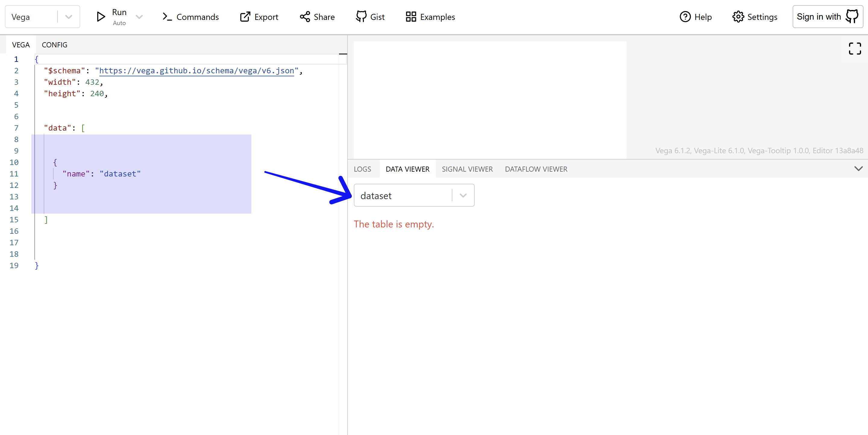
  <li><strong><code>name</code></strong>: This is the only <strong><em>required</em></strong> property. Each dataset must have a unique name. If you use the same name more than once, the last one will overwrite the previous one. If you only provide the <code>name</code> and nothing else, you’ll end up with an empty dataset.</li>
</ul>

<p data-caption="Figure: An empty dataset in Vega"><img src="/assets/images/posts/powerbi/005-01-empty-dataset.png" alt="An empty dataset in Vega" class="has-caption post-img ml-auto mr-auto" /></p>

<ul>
  <li><strong><code>url</code></strong> &amp; <strong><code>source</code></strong>:  Use <code>url</code> to load data from an external source. If you want to create a new dataset from an existing one, use the <code>source</code> property and reference the original dataset’s name. This is especially useful for filtering or transforming data.</li>
</ul>

<pre><code class="language-json">{
  "data": [
    {
      "name": "jobs",
      "url": "https://cdn.jsdelivr.net/npm/vega-datasets@3.1.0/data/jobs.json"
    },
    {
      "name": "jobsCopy",
      "source": "jobs"
    }
  ]
}
</code></pre>

<p>In this example, the first dataset (<em>jobs</em>) is loaded from an external link, and then a second one (<em>jobsCopy</em>) is created as a copy.</p>

<ul>
  <li><strong><code>format</code></strong>:  This defines how the data should be parsed. By default, Vega assumes external data is in JSON format. But if you’re working with CSV, TSV, or other formats, you can use the <code>format</code> property to specify the correct type.</li>
</ul>

<pre><code class="language-json">{
  "data": [
    {
      "name": "jobs",
      "url": "https://cdn.jsdelivr.net/npm/vega-datasets@3.1.0/data/github.csv",
      "format": {"type": "csv"}
    }
  ]
}
</code></pre>

<ul>
  <li><strong><code>values</code></strong>:  This is used when you want to hardcode data directly in the spec. The most common format is JSON, but you can also use CSV or other formats—as long as you declare it in the <code>format</code> property.</li>
</ul>

<pre><code class="language-json">{
  "data": [
    {
      "name": "inlineJSON",
      "values": [
        {"a": 9, "b": 7, "c": 5},
        {"a": 19, "b": 27, "c": 35},
        {"a": 99, "b": 79, "c": 59}
      ]
    },
    {
      "name": "inlineCSV",
      "values": "a,b,c\n9,7,5\n19,27,35\n99,79,59",
      "format": {"type": "csv"}
    }
  ]
}
</code></pre>

<p>In the example above, we hardcoded the same dataset in two different formats. Take a look at how they show up in the code editor. Notice anything interesting? 🤔</p>

<h1 id="the-data-block-in-deneb">The ‘data’ Block in Deneb</h1>

<p>If you’re using Vega inside Power BI with Deneb, things work a bit differently—but also more conveniently.</p>

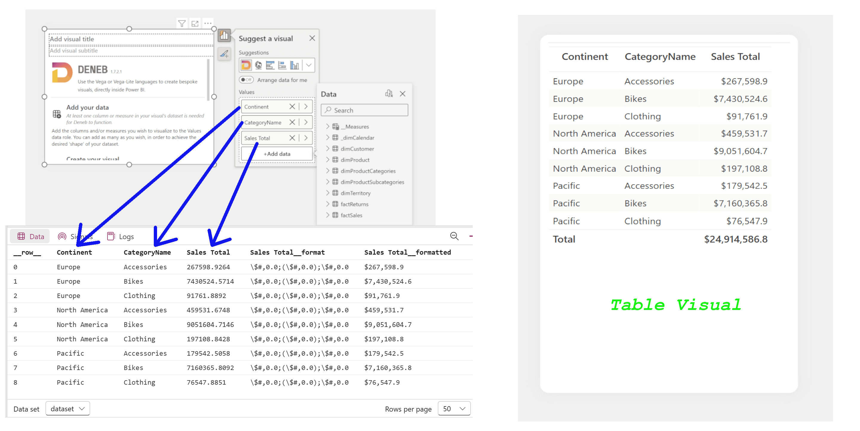
<p>When you drag columns and measures into the Deneb visual, it behaves just like the table visual in Power BI. Deneb automatically creates a dataset called <code>dataset</code> with the fields you’ve included. This dataset is exactly what you’d see in a Power BI table visual—with the same columns, measures, and row order.</p>

<p>To use this dataset in your Vega spec, you just need to reference <code>dataset</code> by name.</p>

<pre><code class="language-json">{
  "data":[
    {
      "name": "dataset"
    }
  ]
}
</code></pre>

<p data-caption="Figure: Dataset in Deneb"><img src="/assets/images/posts/powerbi/005-02-dataset-in-deneb.png" alt="Dataset in Deneb" class="has-caption post-img ml-auto mr-auto" /></p>

<p>You might notice a few extra columns you didn’t add yourself. These are included by Deneb to support interactivity features like highlighting and filtering. We’ll dig into those later.</p>

<h1 id="example-datasets">Example Datasets</h1>

<p>Vega provides a collection of sample datasets in various formats that are perfect for learning and experimenting. You can explore them <a href="https://cdn.jsdelivr.net/npm/vega-datasets@3.1.0/data/" target="_blank" rel="noopener">here</a>. To use any of these datasets, just set the <code>url</code> like this: <code>"https://cdn.jsdelivr.net/npm/vega-datasets@3.1.0/data/&lt;datasetName.format&gt;"</code>. Replace <code>&lt;datasetName.format&gt;</code> with the actual name and format of the dataset you want to use.</p>]]></content><author><name>Nazmul Islam</name></author><category term="powerbi" /><category term="Power BI" /><category term="Vega" /><category term="Deneb" /><summary type="html"><![CDATA[To create any chart in Vega, you first need to bring in your data. This post covers the different ways to load and define datasets using the data block—both in standalone Vega and inside Power BI with Deneb.]]></summary><media:thumbnail xmlns:media="http://search.yahoo.com/mrss/" url="https://nijobair.github.io/assets/images/posts/powerbi/001-title.jpeg" /><media:content medium="image" url="https://nijobair.github.io/assets/images/posts/powerbi/001-title.jpeg" xmlns:media="http://search.yahoo.com/mrss/" /></entry><entry><title type="html">Deneb &amp;amp; Vega - 04: Skull of the Syntax</title><link href="https://nijobair.github.io/posts/powerbi/004-core-syntax/" rel="alternate" type="text/html" title="Deneb &amp;amp; Vega - 04: Skull of the Syntax" /><published>2025-06-30T00:00:00+00:00</published><updated>2025-06-30T00:00:00+00:00</updated><id>https://nijobair.github.io/posts/powerbi/004-core-syntax</id><content type="html" xml:base="https://nijobair.github.io/posts/powerbi/004-core-syntax/"><![CDATA[<h1 id="introduction">Introduction</h1>

<p>Creating a chart with Vega can feel overwhelming, especially when the chart is complex or interactive. But if you understand the core components of Vega’s syntax, you can break down the process into small, manageable chunks—and that makes everything a lot easier. In this post, we’ll go over those core building blocks so you can start thinking in Vega terms.</p>

<h1 id="core-components">Core Components</h1>

<p>Data visualizations can involve many steps, but broadly speaking, the whole process can be divided into three main parts:</p>

<ul>
  <li>Getting and preparing the data</li>
  <li>Indicating what we want to visualize</li>
  <li>Describing how we want to visualize it</li>
</ul>

<p>As our charts get more advanced, we’ll need additional components, but these three are the essentials for getting something on the screen.</p>

<p>In the <a href="/posts/powerbi/003-the-canvas">previous post</a>, we talked about the canvas and how to create one. Once we have our canvas, the first thing we need is data. We use the <code>data</code> block to bring in and prepare the data we want to visualize. This block is where you can import datasets, clean them up, and apply transformations.</p>

<p>Once the data is ready, we need to tell Vega what kind of data goes where. For example, in a column chart, we’ll usually have categories on the x-axis and numeric values on the y-axis. This kind of mapping is done using the <code>scales</code> block.</p>

<p>Finally, we need to tell Vega <em>how</em> we want to visualize the data. Do we want a bar chart? A line? An area chart? A scatter plot? These visual elements are called <em>marks</em>, and they’re defined inside the <code>marks</code> block.</p>

<p>So, the three components you absolutely need to get started are:</p>

<ul>
  <li><code>data</code> — what we’re visualizing</li>
  <li><code>scales</code> — how that data maps to the canvas</li>
  <li><code>marks</code> — what kind of visual elements we use to show the data</li>
</ul>

<p>With just these three blocks, you can already get a chart on the canvas! It might not look very fancy, but it’s a great place to start. The basic structure with these components looks like this:</p>

<pre><code class="language-json">{
  "$schema": "https://vega.github.io/schema/vega/v6.json",
  "width": 500,
  "height": 200,
  
  "data": [ ],
  "scales": [ ],
  "marks": [ ]
}
</code></pre>
<p>Let’s look at a bar chart created using only these core components:</p>

<div id="chart-01" class="has-caption" data-caption="Chart: Bar chart with minimum Vega syntax"></div>
<script type="text/javascript">
  async function run() {
    const container = document.getElementById('chart-01');
    const width = container.clientWidth - 40;
    const height = width * 9 / 16;
    const specs = '/vegaCharts/004-01-bar.json';
    const result = await vegaEmbed("#chart-01", specs, {
      actions: true,
      width: width,
      height: height
    });
    console.log(result);
  }
  document.addEventListener('DOMContentLoaded', run);
</script>

<h1 id="other-components">Other Components</h1>

<p>As your visuals get more complex—or if you want to make them interactive—you’ll need to use a few more components. Here are the most common ones Vega offers:</p>

<ul>
  <li><code>signals</code>: This is where we define variables and parameters to make our visuals interactive. Think of it as adding logic to your visual.</li>
  <li><code>axes</code>: While the <code>scales</code> block defines what kind of data goes where, the <code>axes</code> block tells Vega how to draw those axes—tick marks, labels, orientation, etc.</li>
  <li><code>legends</code>: No surprise here—this is where we customize the legend of our chart.</li>
  <li><code>projections</code>: If you’re creating a map, you’ll need this block to define how geographical data should be projected onto the canvas.</li>
</ul>

<p>So, the top-level structure of a Vega spec with all these elements looks something like this:</p>

<pre><code class="language-json">{
  "$schema": "https://vega.github.io/schema/vega/v6.json",
  "width": 500,
  "height": 200,
  
  "data": [ ],
  "signals": [ ],
  "scales": [ ],
  "projections": [ ],
  "axes": [ ],
  "legends": [ ],
  "marks": [ ]
}
</code></pre>

<p>If you’re familiar with <code>JSON</code>, you’ll notice that each of these blocks are defined as a <span class="jekyll-glossary">  JSON array  <span class="jekyll-glossary-tooltip"><span class="jekyll-glossary-tooltip-hidden">(</span>A JSON array contains zero, one, or more ordered elements, separated by a comma. The JSON array is surrounded by square brackets [ ].<br /><a class="jekyll-glossary-source-link" href="https://www.json.org/json-en.html#:~:text=An%20array%20is%20an%20ordered%20collection%20of%20values.%20An%20array%20begins%20with%20%5Bleft%20bracket%20and%20ends%20with%20%5Dright%20bracket.%20Values%20are%20separated%20by%20%2Ccomma." target="_blank"></a><span class="jekyll-glossary-tooltip-hidden">)</span></span></span>. That means we can include multiple datasets, multiple scales, multiple marks, and so on.</p>

<p>Why is that helpful? Hold your horses—we’ll explore that soon!</p>]]></content><author><name>Nazmul Islam</name></author><category term="powerbi" /><category term="Power BI" /><category term="Vega" /><category term="Deneb" /><summary type="html"><![CDATA[Understanding Vega becomes much easier when you break it down into core components. This post introduces the essential building blocks—data, scales, and marks—that you need to get a chart on the canvas.]]></summary><media:thumbnail xmlns:media="http://search.yahoo.com/mrss/" url="https://nijobair.github.io/assets/images/posts/powerbi/001-title.jpeg" /><media:content medium="image" url="https://nijobair.github.io/assets/images/posts/powerbi/001-title.jpeg" xmlns:media="http://search.yahoo.com/mrss/" /></entry><entry><title type="html">Deneb &amp;amp; Vega - 03: Start with the Canvas</title><link href="https://nijobair.github.io/posts/powerbi/003-the-canvas/" rel="alternate" type="text/html" title="Deneb &amp;amp; Vega - 03: Start with the Canvas" /><published>2025-06-29T00:00:00+00:00</published><updated>2025-06-29T00:00:00+00:00</updated><id>https://nijobair.github.io/posts/powerbi/003-the-canvas</id><content type="html" xml:base="https://nijobair.github.io/posts/powerbi/003-the-canvas/"><![CDATA[<h1 id="introduction">Introduction</h1>

<p>Now that we’re familiar with Vega, we can start building a logical understanding of its syntax. But before diving into the details, let’s take a step back and talk about something very basic—yet super important: <strong>the canvas</strong>.</p>

<h1 id="what-is-a-canvas">What Is a Canvas?</h1>

<p>If you’ve ever done any painting, you already know what a canvas is—it’s the surface where you paint your masterpiece. In Vega, the concept is pretty much the same. The canvas is where all the visual elements live.</p>

<p>The cool part? In Vega, you don’t need to explicitly create a canvas. Since Vega is just a structured <code>JSON</code> file, everything you write goes inside a pair of curly braces <code>{}</code>. These outermost braces automatically create a canvas for you.</p>

<p>So if you just type <code>{}</code> in the code editor, Vega technically creates a canvas. But—here’s the catch—you won’t <em>see</em> anything. Why? Because that canvas is <strong>0 pixels wide and 0 pixels tall</strong>. <em>It’s invisible</em>.</p>

<h2 id="lets-make-it-visible">Let’s Make It Visible</h2>

<p>To actually <em>see</em> the canvas, we need to give it some dimensions. We can do that using the <code>width</code> and <code>height</code> properties. And to make things more obvious, let’s also give it a background color using the <code>background</code> property.</p>

<p>Here’s how that looks in Vega:</p>

<pre><code class="language-json">{
  "width": 250,
  "height": 100,
  "background": "grey"
}
</code></pre>

<p>And now, the result is something you can see—an actual grey canvas!</p>

<div id="chart-01" class="has-caption" data-caption="Chart: Vega canvas"></div>
<script type="text/javascript">
  async function run() {
    const container = document.getElementById('chart-01');
    const width = container.clientWidth - 40;
    const height = width * 9 / 16;
    const specs = '/vegaCharts/003-01-canvas.json';
    const result = await vegaEmbed("#chart-01", specs, {
      actions: true,
      // width: width,
      // height: height,
    });
    console.log(result);
  }
  document.addEventListener('DOMContentLoaded', run);
</script>

<p>All the visual elements you create will be drawn inside this canvas. Think of it as the stage where your charts and marks perform.</p>

<p>We’ll talk about more customizations you can apply to the canvas later on. For now, let’s shift gears and look at something very helpful—<strong>the schema</strong>.</p>

<h1 id="canvas-coordinates">Canvas Coordinates</h1>

<p>One concept that will come in handy throughout this series is how positioning works in Vega and Vega-Lite. The origin of the canvas is the <strong>top-left corner</strong>, which means the point <code>(0, 0)</code> is located at the top-left of the visualization. From there:</p>

<ul>
  <li>The <strong>x-coordinate</strong> increases as you move to the right.</li>
  <li>The <strong>y-coordinate</strong> increases as you move downward.</li>
</ul>

<p>This is different from the coordinate system many of us learned in school, where the origin is at the bottom-left and the y-axis increases upward.</p>

<p>Understanding this coordinate system makes it much easier to understand how <code>scales</code> and <code>marks</code> work, especially when we start positioning visual elements on the canvas. Play with the interactive visual below to see how the <code>(x, y)</code> coordinates change as you move around the canvas.</p>

<div id="chart-02" class="has-caption" data-caption="Chart: Vega canvas with xy coordinates"></div>
<script type="text/javascript">
  async function run() {
    const container = document.getElementById('chart-02');
    const width = container.clientWidth - 40;
    const height = width * 9 / 16;
    const specs = '/vegaCharts/003-02-canvas-with-xy.json';
    const result = await vegaEmbed("#chart-02", specs, {
      actions: true,
      // width: width,
      // height: height,
    });
    console.log(result);
  }
  document.addEventListener('DOMContentLoaded', run);
</script>

<h1 id="what-is-a-schema">What Is a Schema?</h1>

<p>By now, you know that Vega is a language that describes how visuals should look. Like any language, it has its own set of rules—a grammar, if you will. These rules are defined in what’s called a <em>schema file</em>.</p>

<p>When you include the schema in your code, the editor becomes smarter. It automatically checks your code for errors and highlights them right away. Super helpful!</p>

<p>You can include the schema using the <code>$schema</code> property at the top of your JSON:</p>

<pre><code class="language-json">{
  "$schema": "https://vega.github.io/schema/vega/v6.json",
  "width": 250,
  "height": 100,
  "background": "grey"
}
</code></pre>

<p>Technically, you <em>can</em> write Vega code without including the schema. In fact, we did that earlier just to display the canvas. But without the schema, you’ll probably end up spending hours debugging a missing comma or typo. Not fun at all!</p>

<p>So my advice? Always include the schema. It’s like having a grammar checker for your charts.</p>]]></content><author><name>Nazmul Islam</name></author><category term="powerbi" /><category term="Power BI" /><category term="Vega" /><category term="Deneb" /><summary type="html"><![CDATA[Before drawing anything in Vega, you need to understand the concept of the canvas. This post explains what the canvas is, how to make it visible, and why including a schema makes your life easier.]]></summary><media:thumbnail xmlns:media="http://search.yahoo.com/mrss/" url="https://nijobair.github.io/assets/images/posts/powerbi/001-title.jpeg" /><media:content medium="image" url="https://nijobair.github.io/assets/images/posts/powerbi/001-title.jpeg" xmlns:media="http://search.yahoo.com/mrss/" /></entry><entry><title type="html">Deneb &amp;amp; Vega - 02: Code Editors for Vega</title><link href="https://nijobair.github.io/posts/powerbi/002-vega-editors/" rel="alternate" type="text/html" title="Deneb &amp;amp; Vega - 02: Code Editors for Vega" /><published>2025-06-28T00:00:00+00:00</published><updated>2025-06-28T00:00:00+00:00</updated><id>https://nijobair.github.io/posts/powerbi/002-vega-editors</id><content type="html" xml:base="https://nijobair.github.io/posts/powerbi/002-vega-editors/"><![CDATA[<h1 id="introduction">Introduction</h1>

<p>We learned in the <a href="/posts/powerbi/001-vega-introduction">previous post</a> that Vega is a declarative language where we can create visualizations by declaring the components of the visuals using <code>JSON</code>.</p>

<p>In this post, we will learn about some of the features of the code editors for Vega. If you want to create a standalone visualization using Vega, you can use the <a href="https://vega.github.io/editor/#/custom/vega" target="_blank" rel="noopener"><em>online editor</em></a>. If you are using Vega inside Power BI, Deneb provides a code editor for that.</p>

<p>Understanding how to navigate and use these editors will save you a lot of time later when your visuals get more complex or interactive. So, before diving into coding, let’s get comfortable with the tools we’ll be using.</p>

<h1 id="online-editor">Online Editor</h1>

<p>The <a href="https://vega.github.io/editor/#/custom/vega" target="_blank" rel="noopener"><em>online editor</em></a> for Vega and Vega-Lite is the easiest way to try and test any Vega or Vega-Lite code. You don’t have to download anything—you can use it in any browser. The online editor looks like the following picture:</p>

<p data-caption="Figure: Online Editor for Vega and Vega-Lite"><img src="/assets//images//posts//powerbi/001-01-vega-online-editor.png" alt="Online Editor for Vega and Vega-Lite" class="has-caption post-img ml-auto mr-auto" /></p>

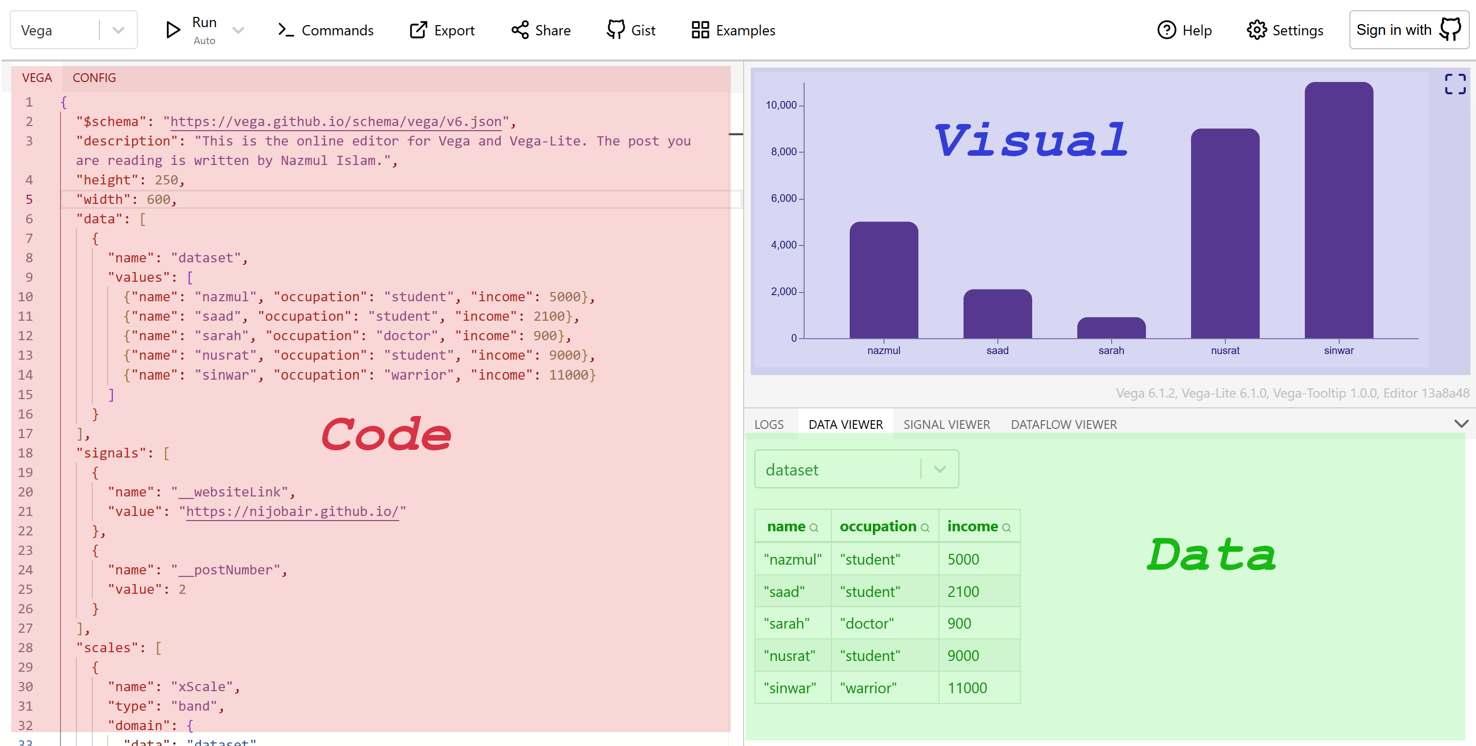
<p>It has three panes: the <strong>left pane</strong> is for writing the code, the <strong>top right pane</strong> is where the visuals are rendered, and the <strong>bottom right pane</strong> shows the raw data, parameters, and logs. The code pane and the visual pane are self-explanatory, but the data pane is extremely important to understand how Vega or Vega-Lite works.</p>

<p>The data pane has four tabs: <strong>LOGS</strong>, <strong>DATA VIEWER</strong>, <strong>SIGNAL VIEWER</strong>, and <strong>DATAFLOW VIEWER</strong>. We can see the error messages in the LOGS tab. The DATA VIEWER shows the datasets used in making the visuals. The SIGNAL VIEWER shows all the signals (signals are variables and parameters used to produce the visuals—we will learn about signals later). And the DATAFLOW VIEWER shows a graphical representation of the connections among all the elements.</p>

<p>This pane helps us understand how Vega is processing the data and transforming it step by step. When our chart doesn’t behave as expected, this is the place to look.</p>

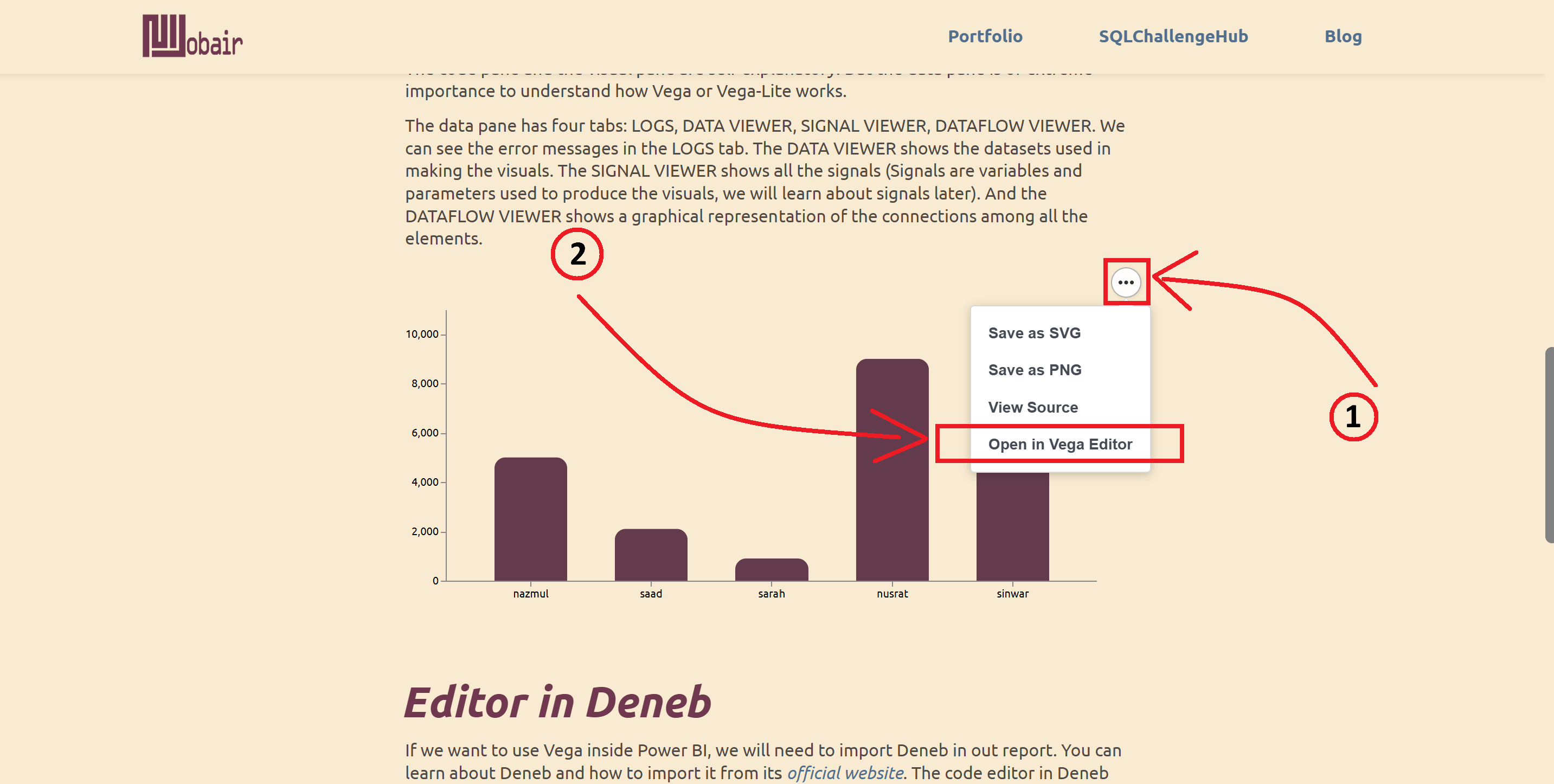
<p>In this series of posts, I will give a lot of examples to help you learn better. You can see the code for a particular chart by clicking on the three dots in the top right corner and selecting ‘<strong><em>Open in Vega Editor</em></strong>’. It will open the online editor in a new tab with the code to create the visual. Similarly, you can select ‘<strong><em>View Source</em></strong>’ to see the <code>JSON</code> code only.</p>

<p>This feature makes it very convenient to learn from others’ charts or to debug your own.</p>

<p data-caption="Figure: How to open the online editor with the current code?"><img src="/assets//images//posts//powerbi/001-02-editor-opener.png" alt="Online Editor opener" class="has-caption post-img ml-auto mr-auto" /></p>

<p>Try this out with the following chart:</p>

<div id="chart-01" class="has-caption" data-caption="Chart: Dummy chart demonstrating Vega functionalities"></div>
<script type="text/javascript">
  async function run() {
    const container = document.getElementById('chart-01');
    const width = container.clientWidth - 40;
    const height = width / 2;
    const specs = '/vegaCharts/002-01-bar.json';
    const result = await vegaEmbed("#chart-01", specs, {
      actions: true,
      width: width,
      height: height
    });
    console.log(result);
  }
  document.addEventListener('DOMContentLoaded', run);
</script>

<h1 id="editor-in-deneb">Editor in Deneb</h1>

<p>If you want to use Vega inside Power BI, you will need to import Deneb into your report. You can learn about Deneb and how to import it from its <a href="https://deneb.guide/" target="_blank" rel="noopener"><em>official website</em></a>. The code editor in Deneb looks like this:</p>

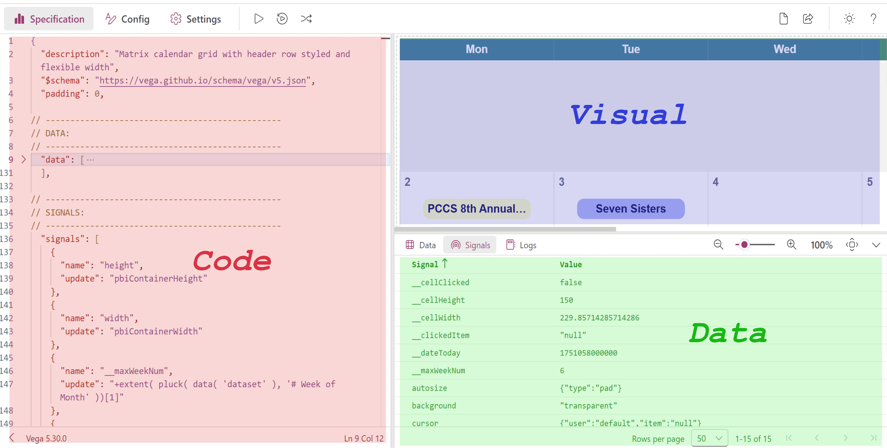
<p data-caption="Figure: Editor inside Deneb in Power BI"><img src="/assets/images/posts/powerbi/001-03-editor-in-deneb.png" alt="Editor inside Deneb in Power BI" class="has-caption post-img ml-auto mr-auto" /></p>

<p>It is quite similar to the <a href="https://vega.github.io/editor/#/custom/vega" target="_blank" rel="noopener"><em>online editor</em></a>. The only thing missing here is the DATAFLOW VIEWER. There are some other minor differences, which I will point out when necessary.</p>

<p>One nice thing about Deneb is that it integrates directly with your Power BI dataset. So instead of hardcoding data like we do in the online editor, we can work with dynamic data that’s already in our report.</p>

<p>For us, the most important pane is the Data pane. As we create more and more complex visuals and want to make our charts interactive, we need to make use of the Data pane quite frequently. It helps us verify what data is actually available to the visual and how it’s structured.</p>

<p>Explore the editors to get familiar with the different components. Don’t worry if some parts seem overwhelming at first—it will make sense as we go along. From the next post, we will start creating the visuals. Stay tuned!</p>]]></content><author><name>Nazmul Islam</name></author><category term="powerbi" /><category term="Power BI" /><category term="Vega" /><category term="Deneb" /><summary type="html"><![CDATA[In this post, we explore the Vega code editors—both the online editor and the one built into Deneb for Power BI. Understanding these tools will help you test, debug, and build complex visuals more efficiently.]]></summary><media:thumbnail xmlns:media="http://search.yahoo.com/mrss/" url="https://nijobair.github.io/assets/images/posts/powerbi/001-title.jpeg" /><media:content medium="image" url="https://nijobair.github.io/assets/images/posts/powerbi/001-title.jpeg" xmlns:media="http://search.yahoo.com/mrss/" /></entry><entry><title type="html">Deneb &amp;amp; Vega - 01: Custom Visuals in Power BI</title><link href="https://nijobair.github.io/posts/powerbi/001-vega-introduction/" rel="alternate" type="text/html" title="Deneb &amp;amp; Vega - 01: Custom Visuals in Power BI" /><published>2025-02-06T00:00:00+00:00</published><updated>2025-02-06T00:00:00+00:00</updated><id>https://nijobair.github.io/posts/powerbi/001-vega-introduction</id><content type="html" xml:base="https://nijobair.github.io/posts/powerbi/001-vega-introduction/"><![CDATA[<h1 id="introduction">Introduction</h1>

<p>Have you ever looked at a Power BI report or dashboard and wondered how some of the visualizations were created? With Power BI’s continuous advancements, many complex visualizations can now be built using native charts, conditional formatting, and DAX measures. However, there are still some charts that simply can’t be created using built-in visuals.</p>

<p>Take, for example, the following chart taken from the Vega example gallery.</p>

<div id="chart-01" data-caption="Chart: A dummy bar chart made using Vega"></div>
<script type="text/javascript">
  async function run() {
    const container = document.getElementById('chart-01');
    const width = container.clientWidth - 40;
    const height = width * 9 / 16;
    const specs = '/vegaCharts/001-01-vega-example.json';
    const result = await vegaEmbed("#chart-01", specs, {
      actions: true,
    //   width: width,
    //   height: height
    });
    console.log(result);
  }
  document.addEventListener('DOMContentLoaded', run);
</script>

<p>Another example is the event calendar below that I created for one of my clients.</p>

<div class="powerbi-embed has-caption" data-caption="Dashboard: Event visualization with custom calendar">
    <iframe title="Event Calendar" src="https://app.powerbi.com/view?r=eyJrIjoiOTYxNDNmM2UtNzJlOC00YzdjLWFhNTctZTAzM2Q0Y2JjZDJhIiwidCI6ImRjM2YyNGU5LTAyYjktNGZiMC05NzE2LWQ1NTYzOTVlNWVlNSIsImMiOjl9&amp;pageName=8b09270edfd60077e6bf" frameborder="0" allowfullscreen="true"></iframe>
</div>

<p>While Power BI does offer many custom visuals through the App Store, some are paid while others are free. Among the free ones, <strong>Deneb</strong> stands out as, in my opinion, the best. Deneb is certified by Microsoft, meaning that it doesn’t access external services or resources and can be exported to PDF or displayed in emails. Pretty cool, right?</p>

<p>Now, plenty of resources explain what Deneb is and how it works, so I won’t go into that. Instead, I want to focus on the language Deneb uses to create these stunning visuals: <strong>Vega</strong> and <strong>Vega-Lite</strong>. Think of them as twin sisters—except Vega is more complex to grasp but also offers more customizations. In this series of posts, we will learn about <strong>Vega</strong>.</p>

<h1 id="what-is-vega">What is Vega?</h1>

<p>Let’s take a look at the definition of Vega from its <a href="https://vega.github.io/vega/#:~:text=Vega%20is%20a%20visualization%20grammar%2C%20a%20declarative%20language%20for%20creating%2C%20saving%2C%20and%20sharing%20interactive%20visualization%20designs.%20With%20Vega%2C%20you%20can%20describe%20the%20visual%20appearance%20and%20interactive%20behavior%20of%20a%20visualization%20in%20a%20JSON%20format%2C%20and%20generate%20web%2Dbased%20views%20using%20Canvas%20or%20SVG." target="_blank" rel="noopener">official website</a>:</p>

<blockquote>
  <p>Vega is a visualization grammar, a declarative language for creating, saving, and sharing interactive visualization designs. With Vega, you can describe the visual appearance and interactive behavior of a visualization in a JSON format, and generate web-based views using Canvas or SVG.</p>
</blockquote>

<p>Simply put, <strong>Vega is a structured way of describing visualizations</strong>, much like grammar in a language. Just as grammar defines the rules for adjectives, adverbs, and prepositions, Vega provides a defined set of rules for building charts. Both Vega and Vega-Lite use JSON syntax, which consists of key-value pairs like: <code>"name": "Nazmul"</code> or <code>"date": "2024-08-05"</code>. This means that every visualization you create in Vega and Vega-Lite is simply a structured JSON object describing the chart.</p>

<h1 id="understanding-vega-the-right-way">Understanding Vega the Right Way</h1>

<p>Now comes the real challenge: <strong>How do we make sense of this language in a logical and intuitive way?</strong></p>

<p>Surely, learning English grammar wasn’t easy. And unfortunately, most existing resources don’t explain Vega’s syntax in a way that’s beginner-friendly. The <a href="https://vega.github.io/vega/docs/" target="_blank" rel="noopener">Official Documentation</a> is comprehensive, but if you jump straight into it—like I did—you’ll feel like you’re reading Martian! <strong>So, Should You Give Up?</strong></p>

<p><em>Absolutely not!</em> That’s where this series comes in.</p>

<p>In this series of posts, I’ll break down the logical structure of Vega in an easy-to-understand way. I’ll not only explain the concepts but also provide plenty of examples to reinforce them.</p>

<h3 id="what-you-should-know-before-we-start">What You Should Know Before We Start</h3>

<ol>
  <li>
    <p><strong>Progressive Learning</strong> – Each post builds on the previous ones. I’ll assume you’ve read the earlier posts and won’t repeat concepts unnecessarily. So, make sure you follow along from the beginning to get the most out of this series.</p>
  </li>
  <li>
    <p><strong>Power BI vs. Vega</strong> – Vega is a standalone visualization language, while Deneb is its Power BI implementation. There are some Power BI-specific features in Deneb that don’t exist in standard Vega. For now, we’ll mainly focus Vega, and once we understand it well, we’ll explore how it works inside Power BI.</p>
  </li>
</ol>

<h1 id="whats-next">What’s Next?</h1>

<p>In the next post, we’ll explore the online Vega editor and the code editor of Deneb. These tools have some features that will help us understand and debug our code easily.</p>

<p>So, are you ready to master Vega? Let’s get started!</p>]]></content><author><name>Nazmul Islam</name></author><category term="powerbi" /><category term="Power BI" /><category term="Vega" /><category term="Deneb" /><summary type="html"><![CDATA[Some charts just aren't possible with Power BI's native visuals—but with Vega and Deneb, you can create stunning custom visuals like gradient area charts and radial plots. This post introduces Vega, the language behind Deneb, and lays the foundation for learning it step by step.]]></summary><media:thumbnail xmlns:media="http://search.yahoo.com/mrss/" url="https://nijobair.github.io/assets/images/posts/powerbi/001-title.jpeg" /><media:content medium="image" url="https://nijobair.github.io/assets/images/posts/powerbi/001-title.jpeg" xmlns:media="http://search.yahoo.com/mrss/" /></entry><entry><title type="html">24 Days of SQL Advent Calendar Challenge: My Solutions</title><link href="https://nijobair.github.io/posts/sql/001-24days-sql-2024/" rel="alternate" type="text/html" title="24 Days of SQL Advent Calendar Challenge: My Solutions" /><published>2025-02-05T00:00:00+00:00</published><updated>2025-02-05T00:00:00+00:00</updated><id>https://nijobair.github.io/posts/sql/001-24days-sql-2024</id><content type="html" xml:base="https://nijobair.github.io/posts/sql/001-24days-sql-2024/"><![CDATA[<h1 id="introduction">Introduction</h1>

<p>SQL is a powerful tool for querying and managing data, but like any skill, it takes practice to master. This holiday season, I challenged myself to complete <strong>24 Days of SQL Advent Calendar Challenge</strong>, a series of SQL problems designed to test and improve my skills. Each challenge presented unique scenarios that required creativity, logic, and a deep understanding of SQL concepts.</p>

<p>In this post, I’ll share my solutions to the challenges along with explanations for how I approached each problem. My goal is to provide clear and concise answers while offering insights into the thought process behind the queries. Whether you’re a beginner looking to learn or an experienced SQL user seeking new ideas, I hope you find this post helpful and inspiring.</p>

<h1 id="about-the-challenge">About the Challenge</h1>

<p>This challenge was created by <em><a href="https://www.linkedin.com/in/data-dawn/" target="_blank" rel="noopener">Dawn Choo</a></em>, a renowned data scientist with over 90,000 followers on LinkedIn. Be sure to follow her for some fantastic resources and insights!</p>

<blockquote>
  <p>Unfortunately, the challenge was closed in January, so it’s no longer available for practice.</p>
</blockquote>

<!-- CHALLENGE 01-->
<h3 id="challenge---01">Challenge - 01</h3>

<p><strong>Question:</strong> A ski resort company want to know which customers rented ski equipment for more than one type of activity (e.g., skiing and snowboarding). List the customer names and the number of distinct activities they rented equipment for.</p>

<p><strong>Answer:</strong></p>
<pre><code class="language-sql">SELECT
    customer_name,
    COUNT(DISTINCT activity) AS dist_activity
FROM rentals
GROUP BY customer_name
HAVING dist_activity &gt; 1;
</code></pre>
<p><strong>Comment:</strong> This is a straight forward question. The question is to get the distinct count of the activities per customer. So, I grouped the results by customer name and then filtered the result to get the customers with more than one distinct activities.</p>

<!-- CHALLENGE 02-->
<h3 id="challenge---02">Challenge - 02</h3>

<p><strong>Question:</strong> Santa wants to know which gifts weigh more than 1 kg. Can you list them?</p>

<p><strong>Answer:</strong></p>
<pre><code class="language-sql">SELECT DISTINCT gift_name
FROM gifts
WHERE weight_kg &gt; 1;
</code></pre>
<p><strong>Comment:</strong> Well, isn’t this an easy one!</p>

<!-- CHALLENGE 03-->
<h3 id="challenge---03">Challenge - 03</h3>

<p><strong>Question:</strong> You’re trying to identify the most calorie-packed candies to avoid during your holiday binge. Write a query to rank candies based on their calorie count within each category. Include the candy name, category, calories, and rank (rank_in_category) within the category.</p>

<p><strong>Answer:</strong></p>
<pre><code class="language-sql">SELECT 
    candy_name, 
    candy_category, 
    calories, 
    RANK() OVER(
      PARTITION BY candy_category 
      ORDER BY calories
    ) AS rank_in_category 
FROM 
  candy_nutrition;
</code></pre>
<p><strong>Comment:</strong> This one is interesting! The question tells us to rank the candies within each category. So I created windows/ partitions for each category and within that window applied the <code>rank()</code> function and then sorted the results by calories.</p>

<!-- CHALLENGE 04-->
<h3 id="challenge---04">Challenge - 04</h3>

<p><strong>Question:</strong> You’re planning your next ski vacation and want to find the best regions with heavy snowfall. Given the tables resorts and snowfall, find the average snowfall for each region and sort the regions in descending order of average snowfall. Return the columns region and average_snowfall.</p>

<p><strong>Answer:</strong></p>
<pre><code class="language-sql">SELECT
    ski.region,
    AVG(snow.snowfall_inches) AS average_snowfall
FROM ski_resorts AS ski
    LEFT JOIN snowfall AS snow
        USING(resort_id)
GROUP BY ski.region
ORDER BY average_snowfall DESC; 
</code></pre>
<p><strong>Comment:</strong> <code>USING</code> is a useful keyword for joining two tables when the column names used for the join are the same.</p>

<!-- CHALLENGE 05-->
<h3 id="challenge---05">Challenge - 05</h3>

<p><strong>Question:</strong> This year, we’re celebrating Christmas in the Southern Hemisphere! Which beaches are expected to have temperatures above 30°C on Christmas Day?</p>

<p><strong>Answer:</strong></p>
<pre><code class="language-sql">SELECT 
    beach_name,
    expected_temperature_c
FROM beach_temperature_predictions
WHERE expected_temperature_c &gt; 30
    AND date = "2024-12-25"; 
</code></pre>

<!-- CHALLENGE 06-->
<h3 id="challenge---06">Challenge - 06</h3>

<p><strong>Question:</strong> Scientists are tracking polar bears across the Arctic to monitor their migration patterns and caloric intake. Write a query to find the top 3 polar bears that have traveled the longest total distance in December 2024. Include their bear_id, bear_name, and total_distance_traveled in the results.</p>

<p><strong>Answer:</strong></p>
<pre><code class="language-sql">SELECT
    pb.bear_id,
    pb.bear_name,
    SUM(tr.distance_km) AS total_distance_traveled
FROM polar_bears AS pb
    INNER JOIN tracking AS tr
        ON pb.bear_id = tr.bear_id
WHERE strftime('%m', date) = "12"   -- BETWEEN also works.
    AND strftime('%Y', date) = "2024"
GROUP BY
    pb.bear_id,
    pb.bear_name
ORDER BY total_distance_traveled DESC
LIMIT 3;
</code></pre>
<p><strong>Comment:</strong> The <code>strftime</code> function in SQLite is a powerful tool for formatting date and time values. It allows you to extract specific parts of a date or time, or to represent them in a variety of formats. This function isn’t available in MySQL, and because I learned SQL with MySQL, I was unaware of it. I struggled a bit to solve the problem, but I eventually learned the function and found a solution.</p>

<!-- CHALLENGE 07-->
<h3 id="challenge---07">Challenge - 07</h3>

<p><strong>Question:</strong> The owner of a winter market wants to know which vendors have generated the highest revenue overall. For each vendor, calculate the total revenue for all their items and return a list of the top 2 vendors by total revenue. Include the vendor_name and total_revenue in your results.</p>

<p><strong>Answer:</strong></p>
<pre><code class="language-sql">SELECT
    v.vendor_name,
    SUM(
        s.quantity_sold * s.price_per_unit
        ) AS total_revenue
FROM vendors AS v
    LEFT JOIN sales AS s
        USING(vendor_id)    -- Same name in both tables.
GROUP BY v.vendor_name
ORDER BY total_revenue DESC
LIMIT 2;
</code></pre>

<!-- CHALLENGE 08-->
<h3 id="challenge---08">Challenge - 08</h3>

<p><strong>Question:</strong> You are managing inventory in Santa’s workshop. Which gifts are meant for “good” recipients? List the gift name and its weight.</p>

<p><strong>Answer:</strong></p>
<pre><code class="language-sql">SELECT
    gift_name,
    weight_kg
FROM gifts
WHERE recipient_type = "good";
</code></pre>

<!-- CHALLENGE 09-->
<h3 id="challenge---09">Challenge - 09</h3>

<p><strong>Question:</strong> A community is hosting a series of festive feasts, and they want to ensure a balanced menu. Write a query to identify the top 3 most calorie-dense dishes (calories per gram) served for each event. Include the dish_name, event_name, and the calculated calorie density in your results.</p>

<p><strong>Answer:</strong></p>
<pre><code class="language-sql">WITH ranked_dishes AS (
    SELECT
        m.dish_name,
        e.event_name,
        CAST(m.calories AS float) / m.weight_g AS cal_density,
        ROW_NUMBER() OVER (
            PARTITION BY e.event_name
            ORDER BY CAST(m.calories AS float) / m.weight_g DESC
            ) AS rank
    FROM events AS e
        LEFT JOIN menu AS m
            USING(event_id)
)
SELECT
    dish_name,
    event_name,
    cal_density
FROM ranked_dishes
WHERE rank &lt;= 3
ORDER BY
    event_name,
    cal_density DESC;
</code></pre>
<p><strong>Comment:</strong> The <code>CAST</code> function here was necessary to convert the data into decimals. I was getting wrong results without it for some reason. Any idea?</p>

<!-- CHALLENGE 10-->
<h3 id="challenge---10">Challenge - 10</h3>

<p><strong>Question:</strong> You are tracking your friends’ New Year’s resolution progress. Write a query to calculate the following for each friend: number of resolutions they made, number of resolutions they completed, and success percentage (% of resolutions completed) and a success category based on the success percentage:</p>
<ul>
  <li><strong>Green:</strong> If success percentage is greater than 75%.</li>
  <li><strong>Yellow:</strong> If success percentage is between 50% and 75% (inclusive).</li>
  <li><strong>Red:</strong> If success percentage is less than 50%.</li>
</ul>

<p><strong>Answer:</strong></p>
<pre><code class="language-sql">WITH temp AS    -- First CTE for grouping.
    (
    SELECT
        friend_name,
        COUNT(resolution) AS res_made,
        SUM(is_completed) AS res_completed
    FROM resolutions
    GROUP BY friend_name
    ),
cte AS          -- Second CTE for success percentage.
    (
    SELECT *,
        (CAST(res_completed AS float) / res_made) * 100 AS per_success
    FROM temp
    )
SELECT *,
    CASE
        WHEN per_success &lt; 50 THEN "Red"
        WHEN per_success &lt;= 75 THEN "Yellow"
        WHEN per_success &gt; 75 THEN "Green"
    END AS success_cat
FROM cte;
</code></pre>

<!-- CHALLENGE 11-->
<h3 id="challenge---11">Challenge - 11</h3>

<p><strong>Question:</strong> You are preparing holiday gifts for your family. Who in the <em>family_members</em> table are celebrating their birthdays in <strong>December 2024</strong>? List their name and birthday.</p>

<p><strong>Answer:</strong></p>
<pre><code class="language-sql">SELECT
    name,
    birthday
FROM family_members
WHERE strftime('%m', birthday) = "12"
    AND strftime('%Y', birthday) = "2024";
</code></pre>

<!-- CHALLENGE 12-->
<h3 id="challenge---12">Challenge - 12</h3>

<p><strong>Question:</strong> A collector wants to identify the top 3 snow globes with the highest number of figurines. Write a query to rank them and include their globe_name, number of figurines, and material.</p>

<p><strong>Answer:</strong></p>
<pre><code class="language-sql">SELECT
    gl.globe_name,
    COUNT(fg.figurine_id) AS num_figurines,
    gl.material
FROM snow_globes AS gl
    LEFT JOIN figurines AS fg
        USING(globe_id)
GROUP BY gl.globe_name
ORDER BY num_figurines DESC
LIMIT 3;
</code></pre>
<!-- CHALLENGE 13-->
<h3 id="challenge---13">Challenge - 13</h3>

<p><strong>Question:</strong> We need to make sure Santa’s sleigh is properly balanced. Find the total weight of gifts for each recipient.</p>

<p><strong>Answer:</strong></p>
<pre><code class="language-sql">SELECT
    recipient,
    SUM(weight_kg) AS total_weight
FROM gifts
GROUP BY recipient;
</code></pre>

<!-- CHALLENGE 14-->
<h3 id="challenge---14">Challenge - 14</h3>

<p><strong>Question:</strong> Which ski resorts had snowfall greater than 50 inches?</p>

<p><strong>Answer:</strong></p>
<pre><code class="language-sql">SELECT resort_name
FROM snowfall
WHERE snowfall_inches &gt; 50;
</code></pre>

<!-- CHALLENGE 15-->
<h3 id="challenge---15">Challenge - 15</h3>

<p><strong>Question:</strong> A family reunion is being planned, and the organizer wants to identify the three family members with the most children. Write a query to calculate the total number of children for each parent and rank them. Include the parent’s name and their total number of children in the result.</p>

<p><strong>Answer:</strong></p>
<pre><code class="language-sql">SELECT
    f.name,
    COUNT(r.child_id) AS total_children
FROM family_members AS f
    INNER JOIN parent_child_relationships AS r
        ON f.member_id = r.parent_id
GROUP BY f.name
ORDER BY total_children DESC
LIMIT 3;
</code></pre>
<p><strong>Comment:</strong> Aliasing table names makes SQL queries shorter, more readable, and easier to maintain, especially when dealing with long table names or when joining multiple tables.</p>

<!-- CHALLENGE 16-->
<h3 id="challenge---16">Challenge - 16</h3>

<p><strong>Question:</strong> As the owner of a candy store, you want to understand which of your products are selling best. Write a query to calculate the total revenue generated from each candy category.</p>

<p><strong>Answer:</strong></p>
<pre><code class="language-sql">SELECT
    category,
    SUM(
        quantity_sold * price_per_unit
    ) AS total_revenue
FROM candy_sales
GROUP BY category;
</code></pre>

<!-- CHALLENGE 17-->
<h3 id="challenge---17">Challenge - 17</h3>

<p><strong>Question:</strong> The Grinch is planning out his pranks for this holiday season. Which pranks have a difficulty level of “Advanced” or “Expert”? List the prank name and location (both in descending order).</p>

<p><strong>Answer:</strong></p>
<pre><code class="language-sql">SELECT
    prank_name,
    location
FROM grinch_pranks
WHERE difficulty IN ("Advanced", "Expert")
ORDER BY
    prank_name DESC,
    location DESC;
</code></pre>

<!-- CHALLENGE 18-->
<h3 id="challenge---18">Challenge - 18</h3>

<p><strong>Question:</strong> A travel agency is promoting activities for a “Summer Christmas” party. They want to identify the top 2 activities based on the average rating. Write a query to rank the activities by average rating.</p>

<p><strong>Answer:</strong></p>
<pre><code class="language-sql">SELECT
    a.activity_name,
    AVG(r.rating) AS average_rating
FROM activities AS a
    LEFT JOIN activity_ratings AS r
        USING(activity_id)
GROUP BY a.activity_name
ORDER BY average_rating DESC
LIMIT 2;
</code></pre>

<!-- CHALLENGE 19-->
<h3 id="challenge---19">Challenge - 19</h3>

<p><strong>Question:</strong> Scientists are studying the diets of polar bears. Write a query to find the maximum amount of food (in kilograms) consumed by each polar bear in a single meal December 2024. Include the bear_name and biggest_meal_kg, and sort the results in descending order of largest meal consumed.</p>

<p><strong>Answer:</strong></p>
<pre><code class="language-sql">SELECT
    b.bear_name,
    MAX(m.food_weight_kg) AS biggest_meal_kg
FROM polar_bears AS b
    INNER JOIN meal_log AS m
        USING(bear_id)
WHERE m.date BETWEEN
    "2024-12-01" AND "2024-12-31"
GROUP BY bear_name
ORDER BY biggest_meal_kg DESC;
</code></pre>

<!-- CHALLENGE 20-->
<h3 id="challenge---20">Challenge - 20</h3>

<p><strong>Question:</strong> We are looking for cheap gifts at the market. Which vendors are selling items priced below $10? List the unique (i.e. remove duplicates) vendor names.</p>

<p><strong>Answer:</strong></p>
<pre><code class="language-sql">SELECT DISTINCT vendor_name
FROM vendors
    INNER JOIN item_prices
        USING(vendor_id)
WHERE price_usd &lt; 10;
</code></pre>

<!-- CHALLENGE 21-->
<h3 id="challenge---21">Challenge - 21</h3>

<p><strong>Question:</strong> Santa needs to optimize his sleigh for Christmas deliveries. Write a query to calculate the total weight of gifts for each recipient type (good or naughty) and determine what percentage of the total weight is allocated to each type. Include the recipient_type, total_weight, and weight_percentage in the result.</p>

<p><strong>Answer:</strong></p>
<pre><code class="language-sql">SELECT
    recipient_type,
    SUM(weight_kg) AS total_weight,
    (
        SUM(weight_kg) * 1.0 / SUM(weight_kg) OVER()
    ) * 100 AS weight_percentage
FROM gifts
GROUP BY recipient_type;
</code></pre>

<!-- CHALLENGE 22-->
<h3 id="challenge---22">Challenge - 22</h3>

<p><strong>Question:</strong> We are hosting a gift party and need to ensure every guest receives a gift. Using the guests and guest_gifts tables, write a query to identify the guest(s) who have not been assigned a gift (i.e. they are not listed in the guest_gifts table).</p>

<p><strong>Answer:</strong></p>
<pre><code class="language-sql">SELECT guest_name
FROM guests
    LEFT JOIN guest_gifts
        USING(guest_id)
WHERE gift_id IS NULL;
</code></pre>

<!-- CHALLENGE 23-->
<h3 id="challenge---23">Challenge - 23</h3>

<p><strong>Question:</strong> The Grinch tracked his weight every day in December to analyze how it changed daily. Write a query to return the weight change (in pounds) for each day, calculated as the difference from the previous day’s weight.</p>

<p><strong>Answer:</strong></p>
<pre><code class="language-sql">SELECT
    day_of_month,
    weight - LAG(weight, 1) OVER(
        ORDER BY day_of_month
        ) AS weight_change
FROM grinch_weight_log;
</code></pre>
<p><strong>Comment:</strong> The <code>LAG</code> function in SQL is a window function that allows you to access data from a previous row within the same result set. It’s incredibly useful for comparing values in the current row with values in a preceding row, often for tasks like calculating differences, trends, or moving averages.</p>

<!-- CHALLENGE 24-->
<h3 id="challenge---24">Challenge - 24</h3>

<p><strong>Question:</strong> Santa is tracking how many presents he delivers each night leading up to Christmas. He wants a running total to see how many gifts have been delivered so far on any given night. Using the deliveries table, calculate the cumulative sum of gifts delivered, ordered by the delivery date.</p>

<p><strong>Answer:</strong></p>
<pre><code class="language-sql">SELECT
    delivery_date,
    SUM(gifts_delivered) OVER(
        ORDER BY delivery_date
    ) AS sum_gifts_delivered
FROM deliveries;
</code></pre>

<p data-caption="Figure: Challenge finishing message"><img src="/assets/images/posts/sql/001-01-congrats.png" alt="challenge finishing screenshot" class="has-caption post-img ml-auto mr-auto" /></p>

<h1 id="conclusion">Conclusion</h1>

<p>Finally, this challenge was such a rewarding experience! It didn’t just sharpen my SQL skills—it also reminded me how fun and engaging problem-solving can be.</p>]]></content><author><name>Nazmul Islam</name></author><category term="sql" /><category term="SQL" /><summary type="html"><![CDATA[I tackled the 24 Days of SQL Advent Calendar this holiday season and I'm sharing my solutions and insights.]]></summary><media:thumbnail xmlns:media="http://search.yahoo.com/mrss/" url="https://nijobair.github.io/assets/images/posts/sql/001-title.jpeg" /><media:content medium="image" url="https://nijobair.github.io/assets/images/posts/sql/001-title.jpeg" xmlns:media="http://search.yahoo.com/mrss/" /></entry><entry><title type="html">My Approach to Naming Conventions in VBA Code</title><link href="https://nijobair.github.io/posts/excel/001-my-vba-naming-convention/" rel="alternate" type="text/html" title="My Approach to Naming Conventions in VBA Code" /><published>2024-01-01T00:00:00+00:00</published><updated>2024-01-01T00:00:00+00:00</updated><id>https://nijobair.github.io/posts/excel/001-my-vba-naming-convention</id><content type="html" xml:base="https://nijobair.github.io/posts/excel/001-my-vba-naming-convention/"><![CDATA[<h1 id="introduction">Introduction</h1>

<p>As a VBA developer, I’ve come to realize that maintaining clean, consistent, and understandable code is critical, especially for projects that grow over time or involve collaboration. One of the simplest yet most effective ways to achieve this is by using a clear <strong>naming convention</strong> for variables, procedures, and objects in VBA.</p>

<p>In this post, I’ll share the naming convention I follow in my VBA projects. It’s simple, logical, and ensures that anyone reading the code (including future me 🤔!) can easily understand its purpose.</p>

<h1 id="what-are-naming-conventions">What are Naming Conventions?</h1>

<p>Naming conventions are like roadmaps 🛣️ for your code. They provide a clear, consistent way of labeling variables, functions, and other elements so that anyone reading your code can quickly understand its purpose. Imagine trying to navigate a city where street signs are missing or randomly labeled—it would be frustrating and time-consuming. The same applies to coding. When names are clear and follow a pattern, the code becomes easier to read, debug, and extend.</p>

<p>In VBA, where you often deal with objects like worksheets, ranges, and user forms, a good naming convention is especially valuable. It helps you quickly identify what a variable represents or what a procedure does, reducing the chances of errors and making your projects much easier to manage over time.</p>

<h1 id="why-naming-conventions-matter">Why Naming Conventions Matter</h1>

<p>Naming conventions aren’t set in stone, and they’re definitely not a rule you must follow to write code. But here’s the thing—they make life so much easier. Think of them as labels on jars in your kitchen. Sure, you could leave them unlabeled, but having <em>“Sugar”</em> and <em>“Salt”</em> clearly marked saves you from awkward mistakes.</p>

<p>In coding, naming conventions serve a similar purpose. They help you quickly understand what each variable, function, or object does without needing to decipher it every time. For VBA, where you’re often working with Excel objects, a clear naming convention can make your code feel less like a maze and more like a well-organized toolkit. While not obligatory, it’s a small effort that pays off big when debugging, revisiting old projects, or collaborating with others.</p>

<h1 id="my-naming-conventions">My Naming Conventions</h1>

<p>When it comes to naming conventions, I like to keep things practical and straightforward. The goal isn’t to make the names overly complex or follow rigid rules but to create a structure that’s easy to remember and intuitive to use. My approach ensures that variables, procedures, and objects are self-explanatory, helping me (and anyone else reading the code) quickly understand their purpose without digging too deep. Here’s how I structure my naming conventions:</p>

<h3 id="1-variables">1. Variables</h3>

<p>I use <strong>camel 🐫 case</strong> along with certain prefixes to make the purpose clear at a glance. If you’re unfamiliar, <strong>camel case</strong> is a style where the first word is lowercase, and each subsequent word starts with an uppercase letter—like this: <code>myVariableName</code>. It keeps names compact and readable.</p>

<p>For variables, I add the prefix <code>var</code> before all variable names to immediately identify them as variables. This approach ensures consistency and prevents any confusion with object names or other identifiers. As for the actual name, I try to keep it short yet descriptive. For example:</p>

<pre><code class="language-vba">Sub subVariablesEx()
    'Declare Variables:
    Dim varUserName As String
    Dim varIsEmpty As Boolean
    Dim varTotalCost As Double
    Dim varPricesArr() As Variant
    ...
End Sub
</code></pre>

<h3 id="2-procedures--functions">2. Procedures &amp; Functions</h3>

<p>For procedures and functions, I like to keep things straightforward by using prefixes that immediately distinguish between the two. I prefix all my procedures with sub and my functions with fun. This makes it clear at a glance whether a block of code performs an action (<code>sub</code>) or returns a value (<code>fun</code>). Additionally, I name my functions in all caps after the prefix, like <code>funCALC_TOTAL()</code>, to make them stand out. For example, a procedure might be named <code>subUpdateDashboard</code>, while a function could be <code>funSQUARE_ROOT()</code>. This approach keeps my code organized and makes it easier to understand the purpose of each routine. Example:</p>

<pre><code class="language-vba">'PROCEDURE NAME EXAMPLE:
Sub subEditEntry()    
    'Necessary Codes 
End Sub

'FUNCTION NAME EXAMPLE:
Function funSTD()
    'Necessary Calculations    
End Function
</code></pre>

<h3 id="3-constants">3. Constants</h3>

<p>When it comes to constants, I like to keep things bold and obvious. I use all uppercase letters with underscores to separate words, which makes them stand out from the rest of the code. For instance, <code>PI</code>, <code>MY_CONSTANT</code>, or <code>PLANK_CONST</code> are some examples of how I name my constants. This style not only keeps the code clean but also acts as a clear indicator that these values are fixed and not meant to be altered. It’s a simple yet effective way to avoid confusion.</p>

<h3 id="4-modules">4. Modules</h3>

<p>If you’ve read this far, you might assume I use the prefix mod for module names. Well, I don’t—mainly because module names are rarely used inside the code. Instead, I stick with camel case, but I capitalize the first letter as well. For example, I name my modules <code>DataEntry</code>, <code>EditWorkSheet</code>, <code>DataCleaning</code>, and so on. This keeps the names simple, clean, and easy to recognize when navigating through the project.</p>

<h3 id="5-sheets">5. Sheets</h3>

<p>When working with sheets, I like to keep their names both functional and easy to identify. I use the prefix sht to make it immediately clear that I’m referencing a worksheet, followed by a name that reflects its purpose. For instance, <code>shtDashboard</code> is for the dashboard, <code>shtTransactions</code> handles transaction data, and <code>shtPivotTables</code> stores pivot tables. This way, even in a large project with multiple sheets, I know exactly which one I’m working with without any guesswork. It’s all about clarity and avoiding unnecessary confusion.</p>

<h3 id="6-object-names">6. Object Names</h3>

<p>Naming objects like UserForms and controls requires a method that ensures clarity and distinction. I use specific prefixes to indicate the type of object, making it effortless to understand its role in the project. Here’s a quick overview of the prefixes I use:</p>

<figure class="table-wrapper">
  <figcaption>Table: VBA naming prefixes</figcaption>

  <table>
    <thead>
      <tr>
        <th>Prefix</th>
        <th>Object</th>
        <th>Example</th>
      </tr>
    </thead>
    <tbody>
      <tr>
        <td>frm</td>
        <td>UserForm</td>
        <td>frmLogin</td>
      </tr>
      <tr>
        <td>lbl</td>
        <td>Label</td>
        <td>lblStatus</td>
      </tr>
      <tr>
        <td>txt</td>
        <td>TextBox</td>
        <td>txtUserName</td>
      </tr>
      <tr>
        <td>btn</td>
        <td>CommandButton</td>
        <td>btnSubmit</td>
      </tr>
      <tr>
        <td>chk</td>
        <td>Checkbox</td>
        <td>chkAgree</td>
      </tr>
      <tr>
        <td>opt</td>
        <td>OptionButton</td>
        <td>optBangladesh</td>
      </tr>
      <tr>
        <td>img</td>
        <td>Image</td>
        <td>imgCatFight</td>
      </tr>
    </tbody>
  </table>

</figure>

<h1 id="wrap-up-example">Wrap-up Example</h1>

<p>To wrap things up, here’s a practical example that incorporates many of the naming conventions discussed. This code snippet shows how different types of variables, procedures, and objects work together in a simple VBA project. You’ll see camel case for variables, prefixes for procedures and functions, and uppercase for constants. By following these conventions, the code is not only organized but also much easier to read and maintain.</p>

<pre><code class="language-vba">Sub subCalculateInvoice()
    ' Declare Variables:
    Dim varProductName As String
    Dim varQuantity As Integer
    Dim varUnitPrice As Double
    Dim varTotalPrice As Double
    Dim varInvoiceData() As Variant
    
    ' Constants:
    Const TAX_RATE As Double = 0.07
    
    ' Initialize Variables:
    varProductName = "Laptop"
    varQuantity = 5
    varUnitPrice = 1000.0
    
    ' Calculate Total:
    varTotalPrice = funCALCULATE_TOTAL(varQuantity, varUnitPrice)
    
    ' Output Data to Worksheet:
    shtInvoice.Cells(1, 1).Value = varProductName
    shtInvoice.Cells(1, 2).Value = varQuantity
    shtInvoice.Cells(1, 3).Value = varTotalPrice
End Sub

Function funCALCULATE_TOTAL(varQty As Integer, varPrice As Double) As Double
    funCALCULATE_TOTAL = varQty * varPrice * (1 + TAX_RATE)
End Function
</code></pre>

<h1 id="common-pitfalls-to-avoid">Common Pitfalls to Avoid</h1>

<p>While naming conventions are essential, there are a few common pitfalls that you should avoid to keep your code clean and consistent. One mistake is <strong>using vague or overly generic names</strong> for variables and functions. For example, names like <code>varData</code> or <code>funProcess</code> don’t give enough context about what the variable or function is doing. Instead, aim for names that are descriptive and specific to the task, such as <code>varCustomerName</code> or <code>funCALCULATE_TOTAL</code>.</p>

<p>Another pitfall is <strong>inconsistency in naming styles</strong>. Switching between camel case, snake case, or using random prefixes can confuse you or others who need to read your code later. For instance, mixing <code>varTotalCost</code> with <code>total_cost</code> or <code>VarProductName</code> with <code>productname</code> creates unnecessary complexity. Stick to one naming convention and apply it consistently throughout your project. Finally, be careful with abbreviations; while abbreviations can make names shorter, they can also make your code harder to understand. Always prioritize clarity over brevity.</p>

<h1 id="conclusion">Conclusion</h1>

<p>In the end, a solid naming convention can make a world of difference when working with VBA code. It’s all about creating an organized, consistent structure that allows you (and others) to navigate the code with ease. Whether you’re working solo on a project or collaborating with a team, following clear and intuitive naming practices saves time, reduces errors, and makes your code much easier to maintain.</p>

<p>I’ve found that keeping things simple yet descriptive, with prefixes for easy identification, works best for me. Of course, naming conventions can vary from one developer to another, and there’s no one-size-fits-all approach. But if you’re looking for a way to make your VBA projects cleaner and more understandable, I hope this post gave you some useful ideas!</p>

<p><strong>What naming conventions do you follow in your VBA projects?</strong> I’d love to hear your thoughts or suggestions in the comments below! Let’s keep the conversation going and learn from each other.</p>]]></content><author><name>Nazmul Islam</name></author><category term="excel" /><category term="MS Excel" /><category term="VBA" /><summary type="html"><![CDATA[Learn the naming conventions I use in VBA to keep code clean, readable, and easy to maintain. Simple tips for variables, procedures, and more!]]></summary><media:thumbnail xmlns:media="http://search.yahoo.com/mrss/" url="https://nijobair.github.io/assets/images/posts/excel/001-title.jpeg" /><media:content medium="image" url="https://nijobair.github.io/assets/images/posts/excel/001-title.jpeg" xmlns:media="http://search.yahoo.com/mrss/" /></entry></feed>